Progressively-Enhanced Breadcrumb Navigation
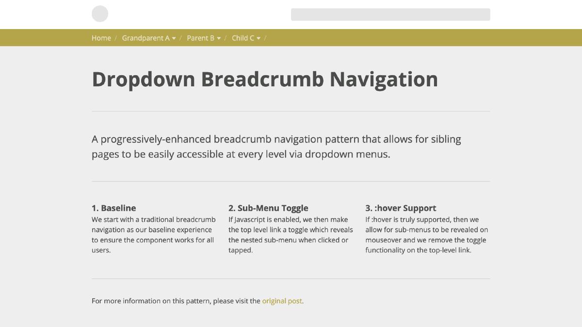
Breadcrumb navigation is an incredibly useful design pattern: it’s simple, recognizable, and it provides great usability. Traditionally, this pattern allows users the ability to retrace their path through the website, with each ‘crumb’ being a link to a parent page. In this post, we’ll walk though how to build a progressively-enhanced breadcrumb navigation that incorporates dropdown menus for each parent page link to allow easy access to sibling pages.
Step 1: Baseline
By starting with baseline experience, we ensure that our component is available in some useable form to all users regardless of browser version, CSS feature support, Javascript feature support, etc.
Base Markup
We’ll start with the markup, which is essentially an unordered list and an additional nested list for each submenu. Let’s take a look:
<ul id="js-breadcrumb" class="breadcrumb">
  <li><a href="#">Home</a></li>
  <li>
    <a href="#" class="breadcrumb__toggle">Grandparent A</a>
    <ul>
      <li><a href="#">Grandparent A</a></li>
      <li><a href="#">Grandparent B</a></li>
    </ul>
  </li>
</ul>
This will provide us with a clean base to build on. Now let’s move on to base styling:
Base Styling
.breadcrumb {
  font-size: 1em;

  > li {
    display: inline-block;
    padding: $base-spacing/2 0;

    &:after {
      content: "/";
      display: inline-block;
      margin: 0 $base-spacing/2 0 $base-spacing/4;
      color: lighten($base-accent-color, 20%);
      font-weight: 300;
    }
  }

  > li > a {
    color: lighten($base-accent-color, 35%);
  }

  @media only screen and (min-width: 40em) {
    font-size: 0.825em;
  }
}

// Set Indicator state to read media queries with Javascript
.breadcrumb:after {
  display: none;

  @media (hover) {
    content: 'hover';
  }
}

.breadcrumb > li:hover > a {
  color: white;
}

.breadcrumb li {
  position: relative;

  ul {
    position: absolute;
    top: 100%;
    left: 0;
    left: -9999px;
    z-index: 2;
    background-color: white;

    a {
      display: block;
      white-space: nowrap;
      padding: $base-spacing/2 $base-spacing;
    }
  }
}
Our base styling for the breadcrumb nav is pretty straight-forward. The basic gists is we align our top-level list items horizontally via display: inline-block and ensure that we apply position: relative to give our nested sub-menus a context. Next, we place the sub-menus under its parent list item with some absolute positioning and hide it off-canvas. For our breadcrumb dividers, we are using generated content (:after) on the top-level list item for some visual separation. This should do it for our baseline breadcrumb nav.
Step 2: Reveal Sub-Menu on Click or Tap
The next step is to allow our sub-menus to be toggled by users that can support the necessary Javascript. LetÆs dive in and tackle this one piece at a time:
Base Javascript
We’ll start by testing if the users browser understands the .addEventListener() method — if it does, then it can proceed. If it doesn’t, then it is returned and the rest of the Javascript isn’t read. This means that legacy browsers like IE8 will fallback to our baseline breadcrumb navigation. Additionally, letÆs add an enhancement class to the document element, which we’ll use later for adding arrows to each dropdown.
(function (win, doc) {
  'use strict';

  // Return if addEventListener isn't supported
  if (!win.addEventListener) { return; }

  // Add Enhancement Class
  doc.documentElement.className += ' ' + enhanceclass;

}(this, this.document));
Toggling the Active State
Provided that the users browser cuts the mustard, we can then listen for click events on elements with the breadcrumb__toggle class, which will fire the breadcrumbListener() method. This method will prevent the default behavior of the link and then toggle our activated class (‘is-toggled’). By targeting this class in our styles, we can reveal the sub-menus on the ‘crumb’ that has been selected:
(function (win, doc) {
  'use strict';

  // Store Variables
  var enhanceclass = 'cutsthemustard',
    breadcrumbNav = document.getElementById('js-breadcrumb'),
    breadcrumbToggleClass = 'breadcrumb__toggle',
    breadcrumbHoverClass = 'is-toggled';

  // Return if addEventListener isn't supported
  if (!win.addEventListener) {
    return;
  }

  // Toggle className Helper Function
  var toggleClassName = function (element, toggleClass) {
    var reg = new RegExp('(\\s|^)' + toggleClass + '(\\s|$)');
    if (!element.className.match(reg)) {
      element.className += ' ' + toggleClass;
    } else {
      element.className = element.className.replace(reg, '');
    }
  };

  // Process event on Breadcrumb Nav
  var breadcrumbListener = function (ev) {
    ev = ev || win.event;
    var target = ev.target || ev.srcElement;
    if (target.className.indexOf(breadcrumbToggleClass) !== -1) {
      ev.preventDefault();
      toggleClassName(target.parentNode, breadcrumbHoverClass);
    }
  };

  // Add Enhancement Class
  doc.documentElement.className += ' ' + enhanceclass;

  // Listen for clicks (or taps) in Breadcrumb Navigation
  breadcrumbNav.addEventListener('click', breadcrumbListener, false);

}(this, this.document));
.breadcrumb li.is-toggled ul {
  left: 0;
}
We also want to be sure to indicate to the user that the crumbs are able to be toggled. To do this, we’ll leverage the class that was added to our element once the browser cut the mustard and add arrows after each toggle element.
.cutsthemustard .breadcrumb__toggle:after {
  content: "";
  display: inline-block;
  vertical-align: middle;
  width: 0;
  height: 0;
  margin-left: $base-spacing/3;
  border-left: 4px solid transparent;
  border-right: 4px solid transparent;
  border-top: 5px solid lighten($base-accent-color, 35%);
}
Things are looking good so far: we have a baseline breadcrumb navigation for users in less capable browsers, and a toggle-enabled breadcrumb navigation which reveals sub-menus for everyone else. What about making things a bit easier for the user and reveal those helpful sub-menus on :hover instead?
Step 3: Reveal Sub-Menu on :hover
The final enhancement is to reveal our sub-menus when the parent list item is moused over, saving the user some clicks. But there is a challenge here: how do we determine if the user is using a mouse versus if they are on a touch-enabled device, and therefore cannot detect mouse events? You would think that it is as simple as testing if the device is touch-enabled; unfortunately, there is no reliable way to detect touchscreen.
Another approach could be to just reveal the sub-menus with the :hover CSS selector. While this will work for devices that do understand mouse events, it becomes problematic on devices that emulate :hover (which is basically all touch device browsers). This is because emulated hovering has some ugly quirks, including hovered elements staying in the :hover state even after the user stops interacting with it. This would not be an ideal side-effect.
But, what if we could test if :hover is properly supported and provide our enhancement only to those devices that pass? With CSS level 4 media queries we have interaction media features, which includes the ‘hover’ media query. Which provides us a reliable way to query the user’s ability to hover over elements on the page. While the support is not perfect, it is enough for us to confidently implement a solution for browsers that do support it, and have our toggle to reveal fallback there for those browsers that don’t support it. Progressive enhancement FTW.
Query for Hover
Our first step in this last enhancement is to add the hover media query to our styling. This can be applied like a normal media query, but we are passing in hover in the query string. Within this media query, we are simply revealing our sub-menus on each parent list item once they are moused over.
@media (hover) {
  .breadcrumb li:hover ul,
  .breadcrumb li:focus ul {
    left: 0;
  }
}
Final Touch
Everything is working great so far. There is just one thing: the top crumb link is being intercepted by our toggle method for users that can properly support hover. This not only prevents the link within from working, but also toggles our menu open if clicked. We can easily fix this by telling our Javascript that hover is supported, and then prevent the event listener on these top level links from being activated. To do this, we can use a pseudo-element on our breadcrumb that is hidden but will have a keyword that can be read in Javascript.
.breadcrumb:after {
  display: none;

  @media (hover) {
    content: 'hover';
  }
}
Next, we will write a method that can check this value and see if it matches. In our case, we are checking if the keyword equals ‘hover’. If it does, we can return before the event listener is added to our breadcrumb toggle elements:
(function (win, doc) {
  'use strict';

  // Return if addEventListener isn't supported
  if (!win.addEventListener) {
    return;
  }

  // Store Variables
  var enhanceclass = 'cutsthemustard',
    breadcrumbNav = document.getElementById('js-breadcrumb'),
    breadcrumbToggleClass = 'breadcrumb__toggle',
    breadcrumbHoverClass = 'is-toggled';

  // Remove string quotes to normalize browser behavior
  var removeQuotes = function(string) {
    if (typeof string === 'string' || string instanceof String) {
      string = string.replace(/^['"]+|\s+|\\|(;\s?})+|['"]$/g, '');
    }
    return string;
  };

  // Get value of body generated content
  var checkBreadcrumbMedia = function() {
    var media = window.getComputedStyle(breadcrumbNav,':after').getPropertyValue('content');
    return removeQuotes(media);
  };

  // Toggle className Helper Function
  var toggleClassName = function (element, toggleClass) {
    var reg = new RegExp('(\\s|^)' + toggleClass + '(\\s|$)');
    if (!element.className.match(reg)) {
      element.className += ' ' + toggleClass;
    } else {
      element.className = element.className.replace(reg, '');
    }
  };

 // Process event on Breadcrumb Nav
  var breadcrumbListener = function (ev) {
    ev = ev || win.event;
    var target = ev.target || ev.srcElement;
    if (target.className.indexOf(breadcrumbToggleClass) !== -1) {
      ev.preventDefault();
      toggleClassName(target.parentNode, breadcrumbHoverClass);
    }
  };

  // Add Enhancement Class
  doc.documentElement.className += ' ' + enhanceclass;

  // Fire checkMedia to get value
  checkBreadcrumbMedia();

  /**
   * Do nothing if pointing device can relay a hover state
   * Else, attach event listener to breadcrumb
   */
  if ( checkBreadcrumbMedia() === "hover" ) {
    return;
  } else {
    breadcrumbNav.addEventListener('click', breadcrumbListener, false);
  }
}(this, this.document));
All done! Here is the final result:
Progressive-enhancement is a great way to add functionality to your components in layers that can build on top of each other, all the while providing fallbacks to browsers that don’t support the necessary features. We have used this methodology to create a breadcrumb navigation that leverages all the usability of the pattern, and then enhances it with additional functionality. In this case, we are allowing for sibling pages to be easily accessible via dropdown menus at every level, but ensuring that a baseline experience is available for less capable browsers.