Media Slat Component
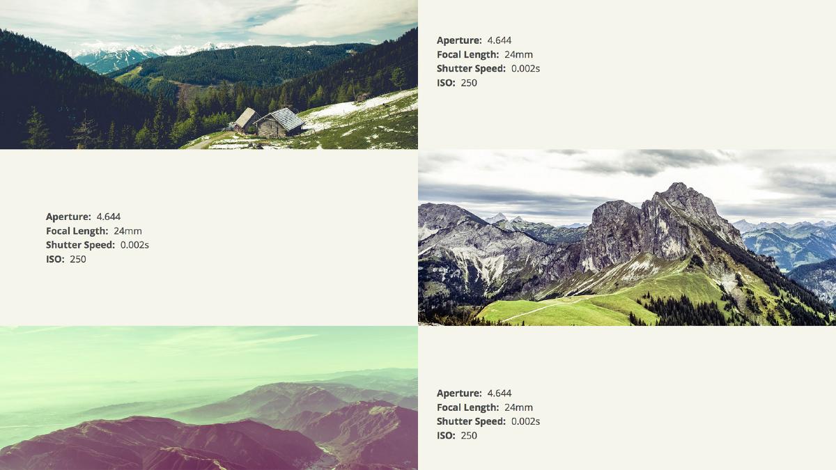
A demonstration of a full-width media component comprised of part text and part image. The component is governed by a few rules: 1) the image must fill it’s designated space at all times, and 2) the image must be inline.
Let’s start by taking a look at the markup behind this component. I’m keeping this simple and semantic by leveraging an <article> tag, and then naming the child sections in the context of the parent element with B.E.M. syntax. The first child element in the slat will be the slat body where all text content will go, and the second child element will be the slat image. The slat image is a content image, therefore it will be inline.
<article class="slat">
  <div class="slat__body">
  // Text content goes here
  </div>

  <div class="slat__item">
  // Inline image goes here
  </div>
</article>
It’s a good idea to leverage a responsive image solution here. This way, we can ensure that only one appropriately-sized image is downloaded.
Next let’s take a look at the styles that make the media slat component work. It’s important to set relative position on the parent element so the children have a context for their positioning. Next, we ensure the width is 100%, that all overflow is hidden, and that the height of the slat is explicitly set. Setting an explicit height is crucial because the children will be absolutely positioned and as a result, the parent will not have a height.
.slat {
  position: relative;
  width: 100%;
  overflow: hidden;

  @media #{$small} {
    height: 150px;
  }

  @media #{$medium} {
    height: 250px;
  }

  @media #{$large} {
    height: 300px;
  }

  @media #{$xlarge} {
    height: 400px;
  }
}
The next step is to define the behavior of the children elements. Both the slat body and slat item will be absolutely positioned. We are moving the elements into their place, centering the text vertically, and defining the image behavior within the slat item container.
.slat__body {
  padding: $base-spacing;
  @media #{$small} {
    position: absolute;
    z-index: 2;
    top: 50%;
    transform: translate( 0, -50% );
    // Adjust alignment of content so that is aligns with non-slat content
    max-width: (map-get($breakpoints, large) - $base-spacing )/2;
  }
  @media #{$large} {
    left: 50%;
    padding-left: 0;
    transform: translate( -(map-get($breakpoints, large) - $base-spacing )/2, -50%);
  }
}

.slat__item {
  @media #{$small} {
    position: absolute;
    z-index: 1;
    top: 0;
    right: 0;
    width: 50%;
    height: 100%;
    overflow: hidden;
  }
}

.slat__item img {
  display: block;
  position: relative;
}
If you have multiple media slats back-to-back, it makes sense to introduce some variation by adjusting the order in which the text and image are displayed. To do this, I am adding a parent modifier class (’.slat--reversed’) which rearranges the order. The following are the styles necessary for this modifier to work:
.slat--reversed {
  .slat__item {
    @media #{$small} {
      right: 50%;
      left: 0;
    }
  }

  .slat__body {
    @media #{$small} {
      left: 50%;
    }
    @media #{$large} {
      transform: translate( 0, -50%);
      padding: $base-spacing*2;
    }
  }
}
I’ve come to like this component quite a lot due to it’s dynamic and versatile nature. Much like the media object component, it is a foundational element that can be modified to create countless variations.