Reducing Design Complexity

To distill a design down to its simplest form, designers must reduce complexity and eliminate anything that distracts from the primary goal of the user. This process is often time-consuming and only possible through repeated iteration and refinement. To help in this process, there are a few strategies I’ve found quite effective when it comes to reducing complexity in my work: thinking mobile-first, leveraging progressive disclosure, and designing with progressive enhancement.
Mobile First
‘Mobile first’ is a strategy that forces designers to consider what’s really important in a product or service. The limited screen real available on smaller screens require us to remove any extraneous elements or features. Additional features and supporting elements can be selectively introduced as screen real estate increases, but they are absent by default. This strategy is effective for simplifying designs because it eliminates the need to cram complex desktop experiences into mobile screens. The result is a design that is focused on key tasks and content without the extraneous obstacles, and therefore a better user experience.
Example of Mobile First
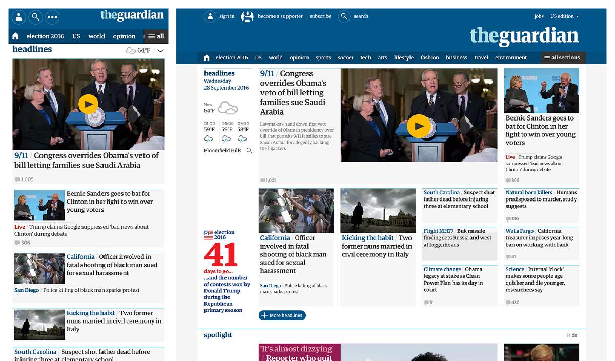
News websites have long been a great example of desktop-centric experiences that fail at providing mobile-friendly content without resorting to a separate mobile version. One stand out exception to this is TheGuardian.com. It’s clear on the Guardian website that smaller viewports have been prioritized by the lack of extraneous elements. As a result, the experience is mobile-friendly without resorting to a separate mobile site, and additional content is revealed as the browser capability and screen real estate increases.
Progressive Disclosure
‘Progressive Disclosure’ is an interaction design technique that displays only important actions or content by default, while making additional features or content easily accessible. The result is a more streamlined interface that helps to keep the use’s attention focused by reducing clutter, confusion, and cognitive load. Anytime we use a dropdown, accordion, or toggle that reveals content that is hidden by default, we are utilizing progressive disclosure. This strategy is incredibly useful for simplifying designs because it enables us to defer less important actions, advanced features, or additional content to a secondary screen (like a dropdown, accordion, or content toggle).
Example of Progressive Disclosure
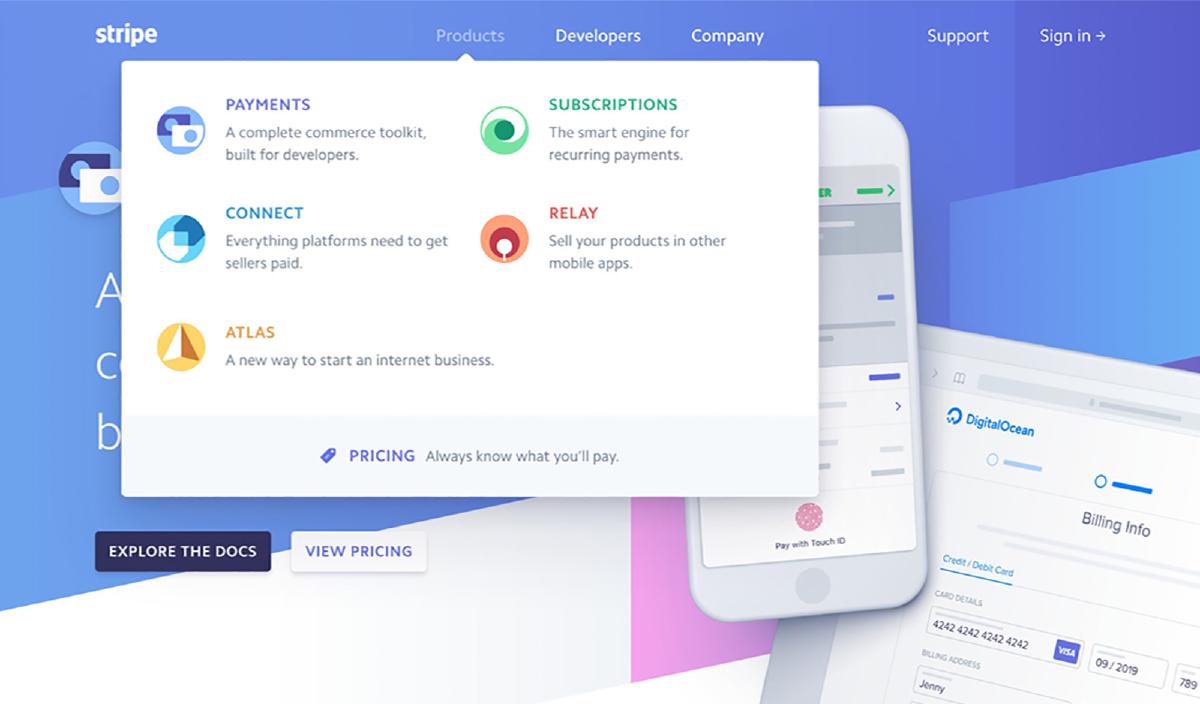
A great example of progressive disclosure can be found on stripe.com: by hovering the mouse over any item in the primary navigation, a menu will appear that reveals the various links in that category. Stripe has created a simple interface in which users can quickly scan and find relevant information without needing to dig through a mountain of content in the process.
Progressive Enhancement
‘Progressive Enhancement’ is a technique that focuses on access to the basic content and functionality for all users, and then layering enhancements to the page for more capable browsers and devices. Much like thinking ‘mobile first’, progressive enhancement forces designers to prioritize a baseline experience that becomes more complex only when appropriate. Progressive enhancement can effectively simplify designs because it requires a shift in mindset: reprioritize the emphasis to what is essential in the experience. It’s a subtle shift that has a lasting effect: spend more time on what’s important and less time on what’s nice-to-have.
Example of Progressive Enhancement
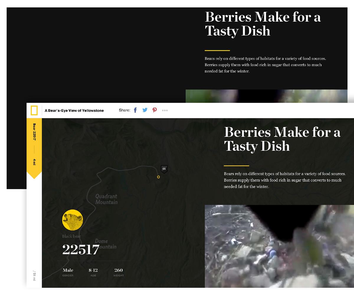
A Bear’s-Eye View of Yellowstone by National Geographic is a great example of progressive enhancement in action. This rich, interactive experience is built around a baseline experience: text and video that tell the story of a bears journey through Yellowstone. The baseline experience is enough to adequately tell the story, but additional features are introduced when additional browser capabilities and space are available. These additional features serve to simply enhance the user’s experience — they aren’t core to the essential content.
By following the strategies I’ve outlined above, it’s possible to dramatically reduce unnecessary complexity in your designs. The result will be an improved user experience that allows users to focus on the pertinent content or features. Give them a try and see how they not only simplify your designs, but simplify your design workflow.

