Smarter Tabs
The task of building adaptable UI components in responsive web design can be quite tricky due to fact that we cannot always predict how the content within any given component will change over time. By building ‘smarter’ components, we can make our UI more adaptable to these conditions.
The Content Predictability Issue
Let’s take for example the common tabs component: a simple yet effective way to display lots of content within a condensed amount of space. If you know the exact amount of content that the tab will hold and can be certain it will not change, you can easily apply different styling to ensure the tabs (and its content) always look good by leveraging CSS media queries. This approach works great in most instances, but what if we cannot control the amount of content the tabs will hold? By relying on specific breakpoints and responding to them with CSS media queries you can maintain this unpredictability up to a point, but eventually the tabs component will break.
A Potential Solution: Smarter Components
One way to deal with this content predictability issue within our components is by making them smarter. Let’s take our tabs example: if we can monitor when there is enough room to fit the tab links that display the content, and do so without the use of CSS media queries, then we can decouple the tabs component from explicit breakpoints.
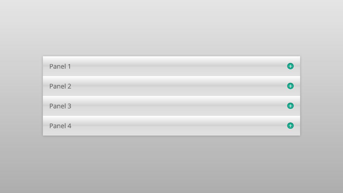
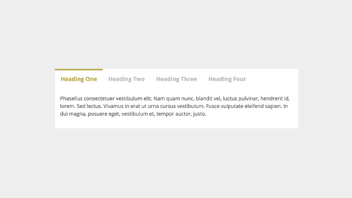
Let’s take a look at our example:
By resizing the browser, you can see that our component starts as a simple accordion at smaller viewports. When there is enough space to fit the tab navigation, the nav links become visible and the component switches to tabs. This is being done without the use of media queries, so you can add or subtract content from the component and this behavior will remain the same! The advantages of this approach becomes apparent when you begin to think about tabs that are being maintained by clients via a content management system, etc.
How It Works
Here is the general gist:
Create clean, semantic markup that will serve as the baseline experience and progressively enhance based on if the necessary Javascript features are available.
If Javascript is available, initialize the function which contains our various methods that power the tabs component and change the class name on the
<html>element from.no-jsto.js. This class will serve as a hook in which we can begin CSS enhancements knowing that the Javascript has our back.Use CSS to hide the body content for each tab and then display it if the parent tab content element has the class we will be using to indicate an active tab. The trick here is to qualify this CSS with the class we are using to indicate Javascript is available, which can be done as follows:
.tab__body {
// If necessary JS features are available
.js &amp; {
display: none;
}
// If parent has active class
.is-active &amp; {
display: block;
}
}
At this point the tabs component enters into its ’accordion’ phase: if a click event is detected within our tabs component and it is on any tab header, then we will toggle the tab content associated with that header and remove the active state from any siblings to ensure only one tab is active at a time.
Another important event to happen during this phase is the creation of the tab navigation, which happens automatically to ensure the navigation is available if needed. This navigation is created via our createNav() function, which works by looping through all headers in each tab content section and creating links that contain href values based on its parent container’s ID attribute. We are then inserting this navigation within the tabs component and allowing CSS to hide it until needed.
- Next, we will check to see if the tabs navigation that was created dynamically is narrower than the tab container. By firing this function immediately and then checking on page resize via a throttled function, we are ready to add our final enhancement class to the parent component if the conditions are right. When they are, we add our enhancement class and let CSS take care of the rest by hiding all tab headers and displaying the navigation. Thus, we have our fully enhanced tabs component, and when a tabs link is clicked we can toggled the corresponding content.
Potential Drawbacks
Taking this approach certainly has its limitations: We are limited on how we can style the tabs because we must be able to read the total width of the navigation, thus it must shrink to wrap its children links and cannot be 100% width (which would prevent an accurate width to compare to the total width of the tab parent). With that being said, this small styling sacrifice is ok when you are trading it for reliable behavior and reasonable fallbacks across all browsers, or peace of mind when it comes to an undetermined amount of content.