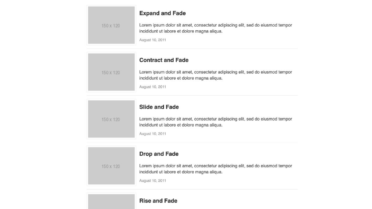
Flexbox Media Object Pattern
The media object is a simple design pattern consisting of an image and adjacent text which has the flexibility to serve a multitude of purposes when laying out content for the web. Once it is abstracted into a reusable component, it has been said to “save hundreds of lines of code”, as well as being the poster-child for Object Orient CSS. The following is a pattern I’ve been using when harnessing the power of the media object which takes advantage of the Flexible Box Layout Module (Flexbox) with a table-based fallback for legacy browsers:
For the purposes of brevity, I have not included browser prefixes or legacy flexbox code. I strongly recommend Autoprefixer for such task.
I start with a clean markup pattern that differentiates the parent element from block elements contained by the parent element:
<div class="media">
  <div class="media__item">
    <img src="path/to/image.jpg"/>
  </div>

  <div class="media__body">
    <h2>Heading</h2>
    <p>Lorem ipsum...</p>
  </div>
</div>
Next I enable flexbox on the parent element by setting display:flex, and vertically center the children elements with align-items:center. In addition to this I am setting some simple padding/margin.
/* Block */
.media {
  display: flex;
  align-items: center;
  margin: 0 0 1em;
  padding: 0 0 1em;
}
The next step is to create our block elements: the media item, which can be an image, video, icon or any other visual element, and our media body which is any textual content. I then apply flex:1 to the media body, which will establish the flexibility of the media body in relation to the media item; in this case, take up the remaining width of the container. I then apply some default padding to the media item, which will provide space between it and the media body.
/* Block Elements */
.media__item {
  padding: 0 1em 0 0;
}

.media__body {
  flex: 1;
}
There it is! We have a achieved a basic media object abstraction which can be reused, all with very little amounts of code. But, what if we want the text to align to the top or the bottom of the media item? We can create some simple modifier classes for this:
/* Block */
.media {
  display: flex;
  align-items: center;
  margin: 0 0 1em;
  padding: 0 0 1em;

  /* Block Modifiers */
  &.media--top {
    align-items: flex-start;
  }

  &.media--bottom {
    align-items: flex-end;
  }
}
There could also be instances when you want to reverse the order of the block items in the markup so that the media body comes before the media item. The following addition to the media item CSS will allow for the proper spacing. You can then add the modifier classes to the parent element, and ensure that the padding around the media item is reversed.
.media__item {
  padding: 0 1em 0 0;

  .media--rev & {
    padding: 0 0 0 1em;
  }
}
Finally we create the fallback code for browsers that do not support flexbox. To test for flexbox support I use Modernizr, which will add a class of ‘no-flexbox’ class to the element if flexbox is not supported. Browsers that don’t understand flexbox will simply ignore the previous CSS, but will pick up on the following fallback classes:
/* Fallback */
.no-flexbox .media {
  display: table;
  width: 100%;
}

.no-flexbox .media__item,
.no-flexbox .media__body {
  display: table-cell;
  vertical-align: middle;
}

.no-flexbox .media--bottom .media__body,
.no-flexbox .media--bottom .media__item {
  vertical-align: bottom;
}

.no-flexbox .media--top .media__body,
.no-flexbox .media--top .media__item {
  vertical-align: top;
}
And we are done! The next step would be to add any styling you want to apply to media container and children elements, but you now have a simple abstraction to reuse anywhere. The code is lightweight and modifier classes can be added for conditional styling without fragmenting the code to accommodate single styling scenarios. The following is our completed code:
/* Block */
.media {
  display: flex;
  align-items: center;
  margin: 0 0 1em;
  padding: 0 0 1em;

  /* Block Modifiers */
  &.media--top {
    align-items: flex-start;
  }

  &.media--bottom {
    align-items: flex-end;
  }
}

/* Block Elements */
.media__item {
  padding: 0 1em 0 0;

  .media--rev & {
    padding: 0 0 0 1em;
  }
}

.media__body {
  flex: 1;
}

/* Fallback */
.no-flexbox .media {
  display: table;
  width: 100%;
}

.no-flexbox .media__item,
.no-flexbox .media__body {
  display: table-cell;
  vertical-align: middle;
}

.no-flexbox .media--bottom .media__body,
.no-flexbox .media--bottom .media__item {
  vertical-align: bottom;
}

.no-flexbox .media--top .media__body,
.no-flexbox .media--top .media__item {
  vertical-align: top;
}