Laws of UX V2.0

Laws of UX was launched in January 2018 with the goal to make complex psychology heuristics more accessible to designers. Since this time, I’ve gotten some great feedback on the site, which I’ve collected in preparation for a major update. This post takes a closer look at the goals of this update, challenges I faced along the way, and how success was measured.
Primary Goals
The first task was to define what my primary goals would be for this redesign. In the three years since the initial launch of the website, I made relatively few design or development updates — most of the focus was on further expanding the content. The redesign was an opportunity to address the things I’ve been wanting to do for a while and I had a substantial list, so priortization was key. The following items are what I eventually identified would be the primary goals to focus on:
- Refresh UI
- Increase scanability of the home page
- Prioritize accessibility
- Prioritize performance
- Enable offline browsing
- Refactor develop tooling to leverage Hugo for statics site generation
- Expand content to include pages related to the Laws of UX book and additional information.
There were also a number of secondary goals such as implementing responsive typography for fluid type sizing, generating an RSS feed for the home page, and removing all Javascript dependencies. These items were still important but just less of a priority given the impact the primary goals.
Refresh UI
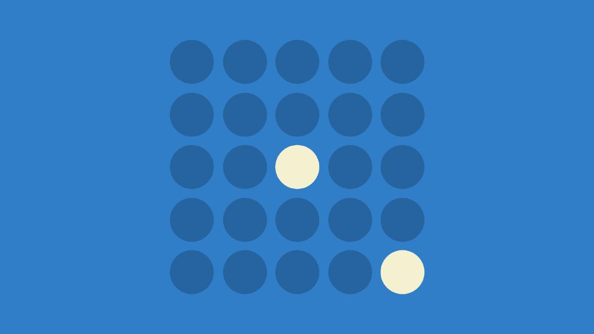
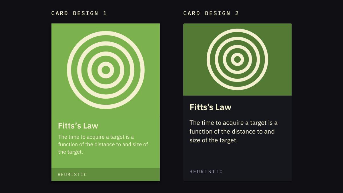
While the website has served it’s intended audience quite well over the years, there’s always room for improvement. A key element that I wanted to iterate on was the overall color harmonization. The colors of the last design worked well but I saw an opportunity to improve this more by adding a hint of color to background, which was previously a neutral dark gray. This UI trick is useful for ensuring colors synchronize and once I applied this change, the various colors featured by each card paired much better with the site background color. In addition to this global color change, I also darkened many of the colors featured in the cards to increase contrast for better readability.
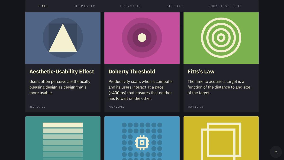
Increase Scanability
As the content on the site continues to grow, the need for better scannability on the homepage has increased. To help with this, I refactored the homepage to feature a card grid that allows visitors to quickly scan the page and find the item they’re looking for. I’ve also included a handy filter that further increases the ability to find specific content via browsing by category.
Prioritize Accessibility
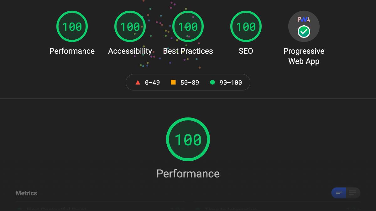
Accessibilty was a metric I paid close attention to with this redesign. Using Google’s Lighthouse tool to audit each page, I honed in on this metric to identify issues I needed to address. This meant ensuring the site was tranversable via keyboards and screenreaders, items were tagged with the correct ARIA attributes, sufficient color contrast was provided, headings follow a logical order, and much more.
There’s a number of handy features for testing accessibility embedded right in the developer tools of modern browsers. The abilty to test color contrast, check for appropriate labels for screen readers, and evaulate support for keyboard navigation are available without additional browser extensions. Check out Seven ways to test for accessibility of your web site with browser Developer Tools to learn more.
Color Contrast
Color contrast was an item I needed to spend a little extra time with during this process. The reason for this was because many of the original colors didn’t provide sufficient contrast with the light text. To correct this issue, I used the developer tools in Chrome to inspect text elements on the page and modified the brightness + saturation of each color until it met WCAG AA compliance. This was effective for larger text such as the heading elements on detail pages, but wasn’t effective for the smaller description text on cards. To ensure the description text of all cards met the same contrast criteria, I modified them to display on the same dark background color.
Prioritize Performance
Performance was another metric I wanted to spend a lot of time on with the redesign. The site has always been relatively fast, but the redesign opened up an opportunity for me to really consider performance as a key design feature. Changes such as replacing GSAP with CSS animations on the hero banners of each page, removing unnecessary Javascript plugins and inlining critical CSS all helped to ensure the site performance was blazing fast. In addition, I made sure to follow performance best practices setting srcset and sizes information on images, subsetting fonts and serving up optimized file formats, concatenating and minifying all CSS and Javascript.
Cumulative Layout Shift
One challenge I faced regarding performance was acheiving a 100 on Lighthouse due to a less than ideal cumulative layout shift (CLS), the visual stability measurement that helps identify unexpected layout shifts. This is an important metric to track because layout shifts that occur during the lifespan of the page can cause items to shift around for users. This can be especially annoying and sometimes downright disorienting when they are reading text, focusing on an image, or watching a video. Even worse, they could be attempting to interact with something on the page and inadvertently select something else by accident.
Many of the layout shifts throughout the site were resolved by ensuring styles associated with anything that’s visible at the top of each page is inlined into the <head> of the page. This ensured that critical styles are applied as soon as possible, minimizing the jump that occurs to elements once the full CSS file is loaded and parsed. The subtle background graphics on each page were also affecting the CLS score, even though they are absolute positioned. I managed to resolve this issue by continuing to position the parent element absolutely, but positioning the individual elements via CSS transforms instead setting top or left values.
Enable Offline Browsing
Another primary goal with this redesign was to ensure the website would met the criteria for being a progressive web app (PWA). This means the site is not only fast and reliable, but can saved to homescreen and even viewed offline. The offline viewing part was especially important here because it ensures the content that visitors have viewed is saved in the background and still available if connection is disrupted or unavailable.
Service Workers are quite powerful scripts and can enable quite a lot of really handy features such caching content for improved performance, caching content for offline viewing, and more. They can also be a bit tricky to work with. I found this article on the Google Developers blog quite handy for wrapping my head around caching files with service workers.
Refactor Develop Tooling
The first version of the website was built using a combination of Nunjucks for templating, Sass for CSS preprocessing, and bringing it all together with Gulp for task automation. This all worked fine but I’ve come to really appreciate Hugo and it’s baked-in asset pipeline to simplify my development workflow. The redesign was an opportunity to rebuild the website with Hugo and therefore consolidate more projects I manage under a single stack; minimizing the cognitive load I take on each time I need to update something on the website.
By embracing static site generators, dropping Sass in favor of (Post) CSS, leveraging Hugo’s asset pipeline features, deploying with Netlify and augmenting my builds with Netlify Build Plugins, I’ve managed to significantly reduce the decisions needed to spin up a working environment and be productive in each development session. This change has given me the ability to focus on delivering the best possible user experience by removing the complexity debt that often times becomes a focus during the development process.
Expand Content
The intial release of the website in 2018 featured 8 heuristics. Since this time, it’s grown to 21 as I continue to add and update content. The redesign provided an opportunity to create a proper space for some new items.
Book
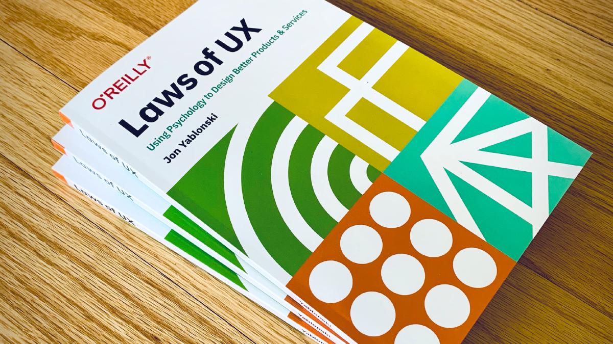
In April 2020, I published a book based on this project with O’Reilly Media. The book provides an accessible introduction into the psychology fundamentals that have a direct influence on design and how people process and interact with the interfaces we create. It’s full of examples and intended to be easily read and referenced by designers who wish to incorporate this information into their daily work. I wanted to be sure to have a dedicated space on the redesigned website to highlight this book because I’m not only proud of it, but also because it provides a great path for diving deeper into many the concepts included on the website.
Store link
In addition, the request for larger prints available for purhcase has been in the back of my mind for a while, so I launched an online store at the end of last year to provide these. I’ve included a link to this store via the header to ensure folks know where to go to find these posters if they’d like to purchase one. One of my favorite things about Laws of UX is the photos that folks share with me featuring the posters available via the website prominently displayed on office walls. I’ve always hoped these posters would help to inform design decisions, guide feedback and discussion, and promote an awareness on the intersection of psychology and UX design in general.
Measuring Success
In order to measure the success of many of the goals above, I leveraged Lighthouse to determine if I was meeting criteria specific to performance, accessibility, best practices and enabling offline viewing. Lighthouse is pretty fantastic because it integrates right into my exisitng development tooling (Chrome developer tools) and provided additional information related to flagged items. To top things off, it even provides a nice easter egg once you manage to get 100 across the board.
I’m happy where things landed with this redesign and I hope those that visit the updated website are as well. As with all things, change is good and this redesign is an effort to keep Laws of UX evolving and improving to ensure it remains a valuable and efficient resource for designers. I look forward to hearing thoughts and feedback on the all new design!