Familiar vs Novel

Familiarity enables the transfer of experience between similar products or services, allowing us to be productive without first learning how a system works. When we encounter familiar interface patterns and conventions, we intuitively understand them based on previous experience. This rule of thumb is the basis of Jakob’s Law and helps guide design decisions.
This article was originally published on Laws of UX.
However, a common question is whether there is an appropriate time to deviate from this principle and design for novelty instead. Like everything in life, there is a time and place to follow the rules and a time to break them. Design is no different. There are times when it is entirely acceptable and perhaps even advantageous to design for novelty.
The Benefits of Familiarity
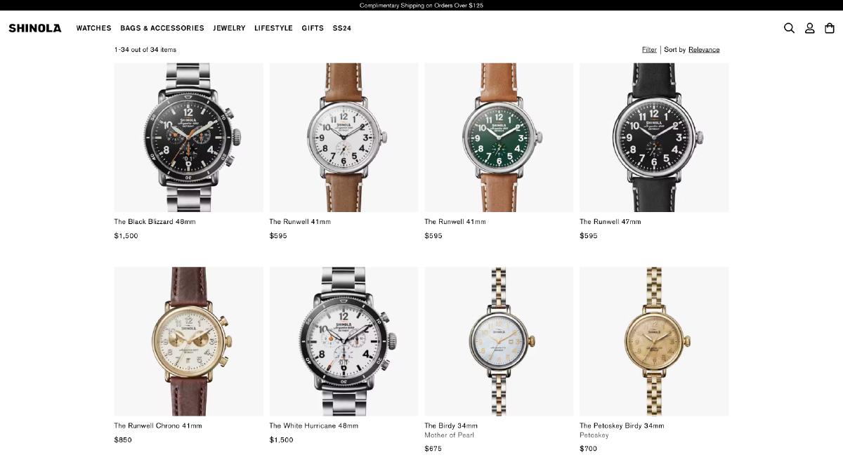
Familiarity with digital products and services comes with major advantages. This is logical because the last thing you want is for your users or customers to have to learn something new, risking confusion and frustration simply because they couldn’t accomplish their intended tasks. However, a familiar interface feels more intuitive due to the mental model formed from past experiences.
Let’s take an e-commerce website as an example. Most e-commerce websites follow very similar patterns and conventions, allowing customers to focus on finding and purchasing the items they’re interested in. The friction that results from an unfamiliar interface is removed because it feels and functions similarly, if not identically, to other e-commerce websites they’ve visited in the past.

In other words, we transfer knowledge from past experiences when facing something new that appears similar. If that something new is your product or service and it matches a pre-existing mental model that the user has already developed, the complexity of the interface becomes less of an obstacle. The interface effectively recedes into the background. The net result is an increased likelihood that they’ll be able to complete their intended tasks without friction, resulting is more sales, more signups, or more conversion.
When to Break from Familiarity
There’s a time and place to follow the rules, and a time to break them. Let’s explore when it’s acceptable and perhaps even advantageous to design for novelty instead. The first use case is when differentiation from competition is the ultimate goal. Separating a product or service from the competitors through branding, features, and unique interactions are all ways to set it apart.

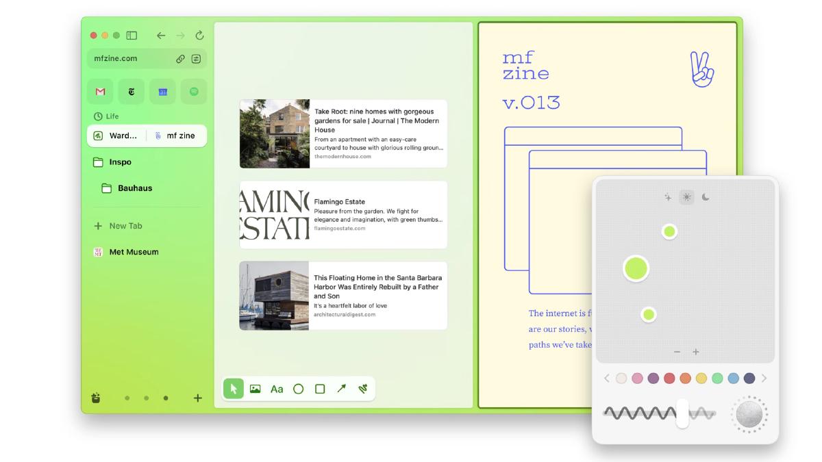
Web browsers have largely shared the same layout, features, and constraints. Arc is challenging the status quo by providing a fresh take on what a browser is and how it works. The browser is differentiated from others because it moves away from the traditional layout, opting for sidebar navigation instead. Additionally, it offers a high level of flexibility and personalization that enables users to tailor their browsing experience.
Utilizing novelty can also be an effective strategy when the goal is to disrupt incumbents with innovative technology. This is commonly seen when a new development threatens an established product or service, and the technology you’re employing has the potential to alter the way people perceive or engage with it.

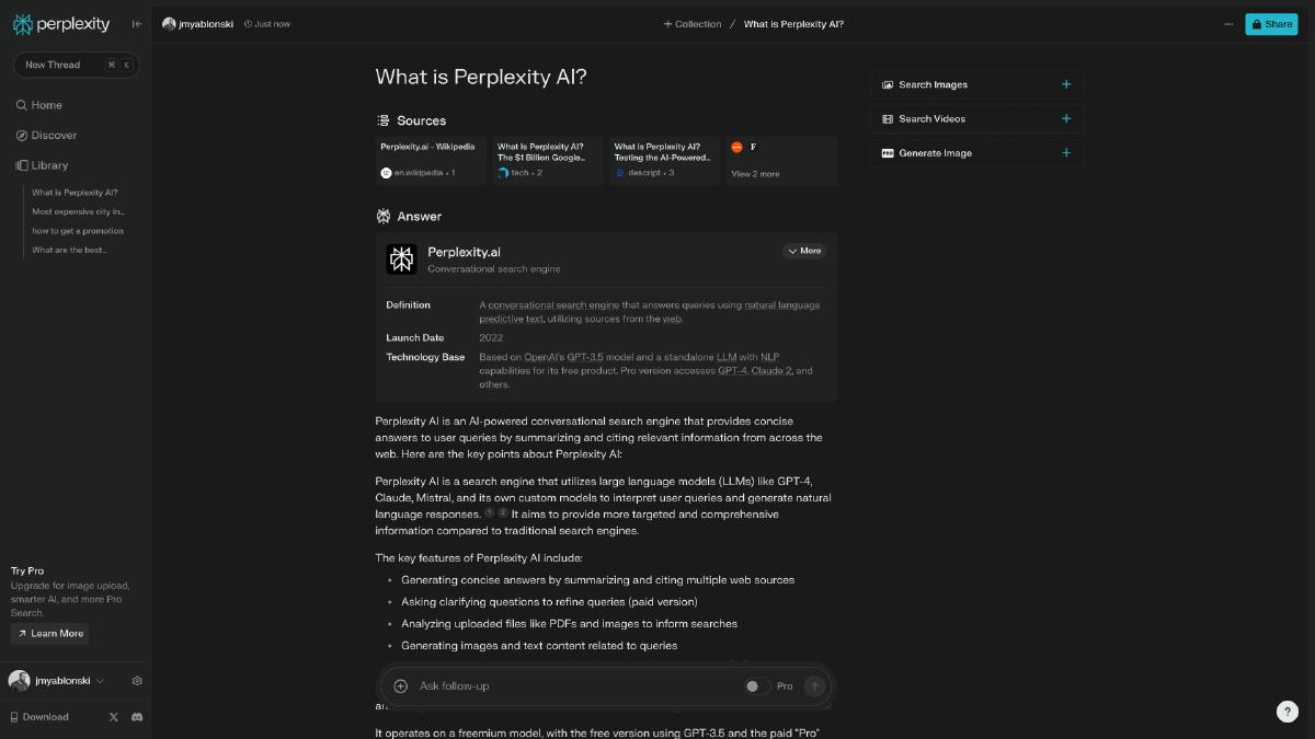
Perplexity is an AI-chatbot-powered research and conversational search engine that uses natural language predictive text to answer queries. Traditional search has largely been dominated by Google, which provides link listings based on search queries. However, advancements in AI and large language models have sparked new ideas about how we search and find things online. Perplexity utilizes the advanced natural language processing capabilities of large language models to accurately understand the intent and context of user queries. It also condenses relevant information from multiple sources into a concise format, eliminating the need for users to sift through multiple links to find the information they seek.
A final use case for leaning towards novelty over familiarity could be when exploration or surprise is the desired outcome. This might involve leveraging novel interaction patterns that will stand out and make the experience more memorable. Non-conventional techniques such as scroll-based interactions are a way to create immersion and engage users through richer engagement with content.
Consider, for instance, Sculpting Harmony, a website that narrates the process of Frank Gehry and his team designing the Walt Disney Concert Hall. This interactive storytelling unfolds as users scroll or swipe, merging architectural exploration, intimate conversations with Frank Gehry, performances by the LA Phil, and rich interactivity into an exhibition. This showcase not only traces the development of the Walt Disney Concert Hall, but also encourages visitors to explore. The interaction model that governs how visitors will use this website supports the goal exploration and creative discovery, and therefore is entirely appropriate. A more conventional interaction model could have been used for the website but it would not have been as engaging or memorable.
User Testing
It’s crucial to bear in mind that, irrespective of the design approach you adopt, it should be firmly rooted in user research and testing. The decision to deviate from familiar design patterns demands a profound understanding of the target audience for whom the design is intended. You must understand their needs, preferences, and behaviors to ensure that the new design produces the desired outcomes.
Implementing unfamiliar design patterns or conventions is a bold move, and while this can potentially yield innovative solutions and unique user experiences, it could also present unfamiliar challenges. Therefore, if these unfamiliar patterns or conventions negatively impact the overall usability or user experience, then they should be thoroughly reconsidered. It’s essential that novelty does not come at the expense of overall usability.
Familiarity in design allows users to transfer their experience between similar products, making them more productive quickly. However, there are times when designing for novelty can be advantageous, such as when differentiation from competition is the goal or when exploration or surprise is the desired outcome. We can leverage elements such as unconventional layouts, interactions, and animations to make an experience feel novel and engage people in a way that makes the experience stand out. Regardless of the design methodology, it must be rooted in thorough user research and rigorous testing to ensure it meets the needs and preferences of the target audience.

