Tesler’s Law

This article was originally published on Laws of UX and is an excerpt from the 2nd edition of Laws of UX: Using Psychology to Design Better Products & Services.
Takeaways
- All processes have a core of complexity that cannot be designed away and therefore must be assumed by either the system or the user.
- Ensure as much as possible of the burden is lifted from users by dealing with inherent complexity during design and development.
- Take care not to simplify interfaces to the point of abstraction.
Overview
Who should bear the burden of complexity within an application or a process— the user, or the designers and developers? This is a fundamental question when considering the design of user interfaces and, more broadly, how humans interact with technology. A key objective for designers is to reduce complexity for the people who use the products and services we help to build, yet there is some inherent complexity in every process. Inevitably, we reach a point at which complexity cannot be reduced any further but can only be transferred from one place to another. At this point, it finds its way either into the user interface or into the processes and workflows of designers and developers.
Origins
The origins of Tesler’s law can be traced back to the mid-1980s, when Larry Tesler, a computer scientist at Xerox PARC, was helping to develop the language of interaction design—a set of principles, standards, and best practices for defining the structure and behavior of interactive systems that was key to the development of the desktop computer and desktop publishing. Tesler realized that interface consistency would benefit not only users but also developers because standards could be encapsulated in shared software libraries. It was later in his career, while working on the Mac app object-oriented framework at Apple, that Tesler created an intermediate “generic application” that enabled developers to build their own applications by modifying the generic application in an object-oriented way. Tesler defined the law of conservation of complexity as a way to sell the idea to Apple management and independent software vendors with the express purpose of establishing standards in mass-market software, but also, more importantly, to reduce complexity for customers. Tesler reasoned that “if a million users each waste a minute a day dealing with complexity that an engineer could have eliminated in a week by making the software a little more complex, you are penalizing the user to make the engineer’s job easier.”1
Complexity Bias
In Chapter 6 we talked about cognitive bias, which serves as a mental shortcut that increases our efficiency by enabling us to make quick decisions without the need to thoroughly analyze a situation. In essence, cognitive bias helps us reserve mental energy so we can use it when it matters most, e.g., for complex problem solving, creative thinking, etc. We get an incredible amount of benefit from our cognitive bias, but there are some downsides as well: it often leads to errors in memory, judgment, and decision making.
Complexity bias is our tendency to favor complex and intricate solutions over straightforward ones, often because complexity is associated with intelligence, expertise, or depth of understanding.2 Simply put, we often give undue credit to complex concepts or view something that is easy to understand as complex and difficult when we are confused or haven’t taken the time to truly understand it. This fallacy was clearly demonstrated in a 1989 paper by Hilary H. Farris and Russell Revlin that studied how people make hypotheses.3 In one experiment, participants were given three numbers and asked to figure out a rule. They could ask if other number sequences followed the same rule, but the real rule was simple: list three numbers that go up. The participants could have said anything like “1, 2, 3” or “3, 7, 99” and been correct. Most didn’t guess it was that simple, opting instead for more complicated rules.
Our inherent bias toward complexity can be especially problematic when we design because it can lead to more complex solutions. When we opt for more complex solutions, we sidestep the need to understand the underlying problem. The more complexity and assumptions a solution has, the greater the chance of failure. When we find ourselves favoring a more complex solution, it’s a good sign that we don’t have enough information or that we need to better understand the underlying problem. In these instances, we can avoid making unfounded assumptions and/or overly complex solutions by spending more time with the problem and deepening our understanding through observation and experience.
Examples
One common way to illustrate Tesler’s law is through the humble email. When you write an email, there are two required pieces of information: who the message is from (you), and to whom it should be sent. The email cannot be sent if either of these is missing, and therefore it’s a necessary complexity. To reduce this complexity, a modern email client will do two things: pre-populate the sender (it can do this because it is aware of your email address), and provide suggestions for the recipient as you begin to type their address, based on prior emails and/or your contacts (Figure 9-1). The complexity isn’t entirely gone; it’s just abstracted away to reduce the effort required of the user. In other words, the experience of writing an email is made a little simpler by moving the complexity of filling in the sender’s and, if possible, the recipient’s address to the email client, which was designed and developed by a team that assumed that burden of complexity when building it.

Taking that a step further, Gmail now leverages artificial intelligence (AI) within your emails through a feature called Smart Compose (Figure 9-2). This intelligent feature can scan what you’ve typed and use that content to suggest words and phrases to finish your sentences, thus saving you additional typing and time. It should be noted that Smart Compose is not the first time-saving feature introduced to Gmail by way of AI—there’s also Smart Reply, which scans an email for context and suggests several relevant quick-reply options.

Another place that Tesler’s law can commonly be observed is in the ubiquitous checkout process found on online shopping sites. Purchasing items online requires customers to provide lots of repetitive information, including billing and shipping details. To simplify this process for customers, it is common to see online stores enable users to have their shipping address inherit the information from their billing address (Figure 9-3). This option simplifies the checkout process for customers in many cases because it prevents them from having to enter duplicate information for shipping. The resulting experience for customers has been effectively simplified, while the complexity required to enable the feature has shifted to the designers and developers responsible for implementing it up front. Simplifying the checkout process even further are services such as Apple Pay (Figure 9-4), which makes paying for items both online and in person even easier for customers. Once they’ve set up an account, people using Apple Pay or similar payment services can purchase items simply by selecting the option during checkout and verifying the details of their purchase—no need to enter any additional information. The customer experience thus becomes significantly less complex, with the complexity again shifted to the designers and developers responsible for the service.


Retail is an area in which you can find many innovative ways to abstract complexity away from users. Take, for example, Amazon’s Go stores (Figure 9-5), which provide a checkout-free shopping experience. First appearing as an experiment in downtown Seattle, they are now popping up in major metropolitan areas all over the United States. With the Amazon Go app installed on their smartphone, a customer can simply check in with the app when they enter the store, grab what they need, and walk out, without ever needing to wait in line, scan their items, or even pay in the store. A little later, the customer receives a receipt, and their Amazon account is charged.

The dizzying array of technology involved in a checkout-free shopping experience like that found in Amazon Go stores is nothing short of astounding. Advanced technology like machine learning, computer vision, and AI must be deeply integrated to allow for people to simply walk into the store, grab the items they wish to purchase, and then walk out. While the friction of shopping is drastically reduced for customers, the complexity that comes along with it must be absorbed by the designers and developers responsible for ensuring it all works.
Advancements in artificial intelligence (AI) are introducing a whole new interaction paradigm in computing history in which users can tell the computer what outcome they want via natural language. This intent-based paradigm sits in stark contrast to the command-based paradigm we’ve lived with for the last couple of decades, which requires commands via user actions within a graphical user interface (GUI), resulting in feedback from the system. With intent-based interaction, the complexity of the system is abstracted away from the user, enabling them to simply describe the outcome they’d like to see. Take, for example, Spark, from product analytics company Mixpanel, which enables users to conduct in-depth analyses of data by simply asking questions in natural language (Figure 9-6).
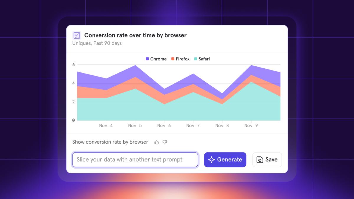
Intent-based interaction via natural language lowers the barrier of knowledge required to interact with software, which is particularly effective with complex products with sophisticated feature sets. This interaction paradigm democratizes access to software and empowers users who know what they want to do but don’t know how to do it to simply describe the outcome they’d like. The barrier for entry required of users to reach “power user” status fades away while giving them access to the same powerful features.
Paradox of the Active User
When it comes to designing software, there’s a very important consideration to remember: users never read software manuals but instead start using the software immediately. This happens because users are often motivated to complete their immediate tasks, and therefore they don’t want to spend time up front reading documentation. It is, of course, a paradox, because users will save time in the long term if they first take time to learn and optimize around the system.
This paradox was first introduced by Mary Beth Rosson and John Carroll in 1987 to explain a common observation in several user studies done at the IBM User Interface Institute.4 They found that new users were not reading the manuals supplied with computers and instead would just get started using them, even if it meant getting into errors and running into roadblocks.
The lesson here is that we must remember to not build products and services for an idealized, rational user, because people don’t always behave rationally in real life. Instead, we can account for this paradox by making guidance accessible throughout the product experience. We can design it to fit within the context of use so that it can help these active new users, no matter what path they choose to take (e.g., tooltips with helpful information).
Managing Complexity with Progressive Disclosure
Progressive disclosure is an interaction design technique that displays only important actions or content by default, while making additional features or content easily accessible. The result is a more streamlined interface that helps to keep the user’s attention focused by reducing clutter, confusion, and cognitive load. Anytime we use a dropdown, accordion, or toggle that reveals content that is hidden by default, we are utilizing progressive disclosure. This strategy is incredibly useful for simplifying designs because it enables us to defer less important actions, advanced features, or additional content to a secondary screen (like a dropdown, accordion, or content toggle).
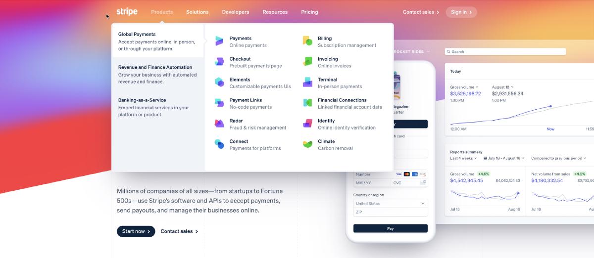
A great example of progressive disclosure can be found on Stripe’s website (Figure 9-7): when you hover the mouse over any item in the primary navigation, a menu will appear that reveals the various links in that category. Stripe has created a simple interface in which users can quickly scan and find relevant information without needing to dig through a mountain of content in the process.
Conclusion
Tesler’s law is important for designers to be aware of because it relates to a fundamental challenge we face throughout our work: how we manage complexity. We must first acknowledge that with any process, there will be a necessary amount of complexity that cannot be removed, no matter how simplified the process becomes as a result of the design process. Everything from a humble email to a highly sophisticated checkout process will have inherent complexity that must be managed. As designers, we have a responsibility to remove inherent complexity from our interfaces, or else we ship that complexity to our users. This can result in confusion, frustration, and a bad user experience. Where possible, designers and developers should handle complexity.

A designer’s guide to using psychology to design better digital products and services.
Dan Saffer, Designing for Interaction: Creating Smart Applications and Clever Devices (Berkeley, CA: Peachpit Press, 2006), 56. ↩︎
Shane Parrish, “Complexity Bias: Why We Prefer Complicated to Simple,” Farnam Street, January 8, 2018, https://oreil.ly/i9di1. ↩︎
Hilary H. Farris and Russell Revlin, “Sensible Reasoning in Two Tasks: Rule Discovery and Hypothesis Evaluation,” Memory & Cognition 17, no. 2 (1989): 221–32, https://doi.org/10.3758/BF03197071. ↩︎
John M. Carroll and Mary Beth Rosson, “Paradox of the Active User,” in Interfacing Thought: Cognitive Aspects of Human–Computer Interaction, ed. John M. Carroll (Cambridge, MA: MIT Press, 1987). ↩︎