Mixpanel Insights Tables
Tables are a useful tool for seeing the precise values from your data and for digging deeper to spot and investigate outliers. My team at Mixpanel improved our Insights table charts to make them ever more valuable for users.
Problem
The previous version of table charts did a good job at providing our customers with the data they need to answer many questions but they were not optimized for how they often used the tables. User research made it clear that Mixpanel customers often want to see how a segment is performing across multiple metrics at one time. In scenarios with high-cardinality segments, comparing segment values across metrics required users to scroll until the finding the next segment they were interested in. This often resulted in losing sight of the previous segment value and the inability to compare metrics at one time, thus diluting the value of the table.
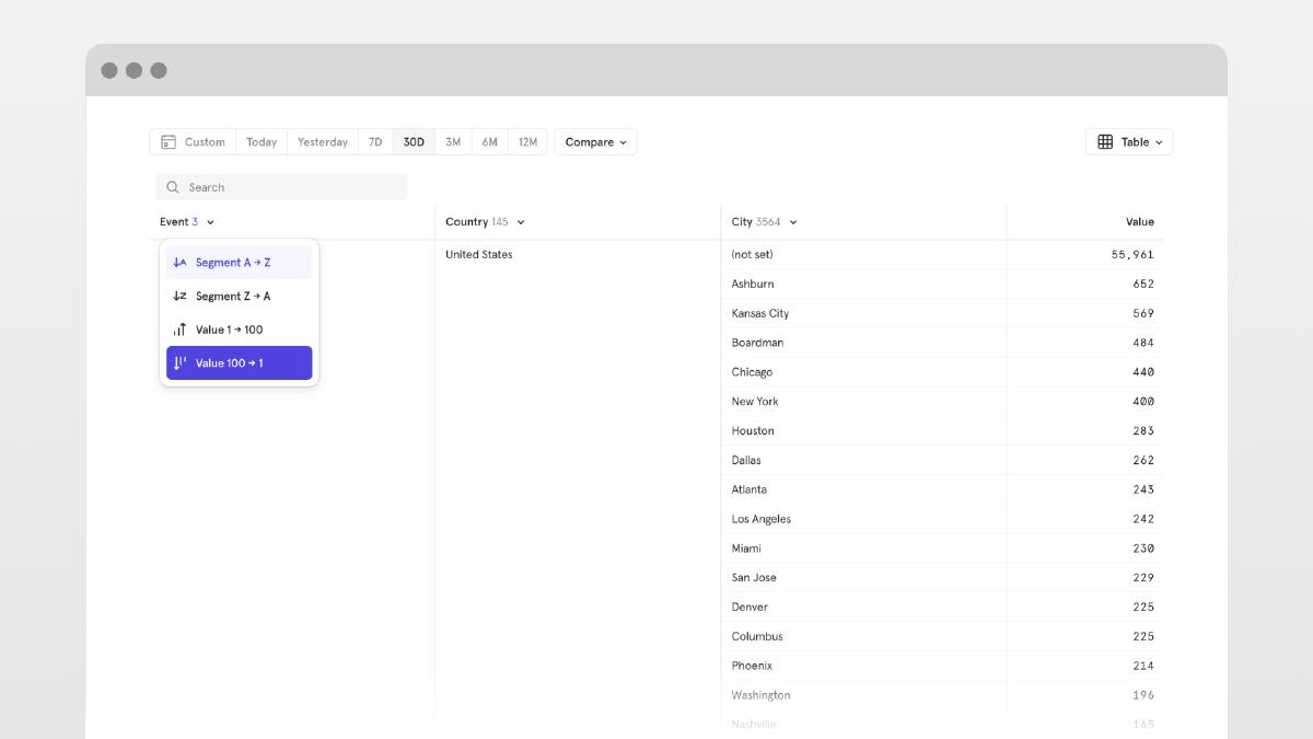
Additionally, it was unclear to users what sorting was being applied at any given moment. Users would often toggle the sorting on each column in an attempt to guess at out how it was affecting the table data, and the ability to sort a specific segment according to a metric wasn’t available.
Solution
Insights Tables should be optimized to let users focus on the health of a segment by displaying multiple metrics side-by-side in a single row. Our solution enables customers to spend less time setting up their visualization and more time getting insights through quick comparison of different segments and metrics.
Solution Walkthrough
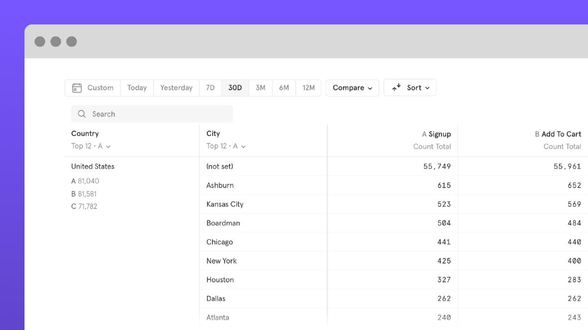
Side-by-Side Metrics
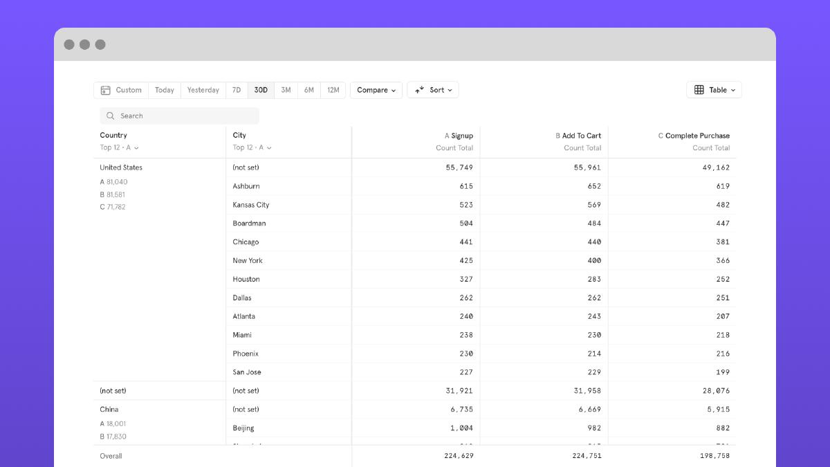
Multiple metrics side-by-side in a single row enable users to bring focus to the overall health of a segment vs metrics.
Improved sorting system
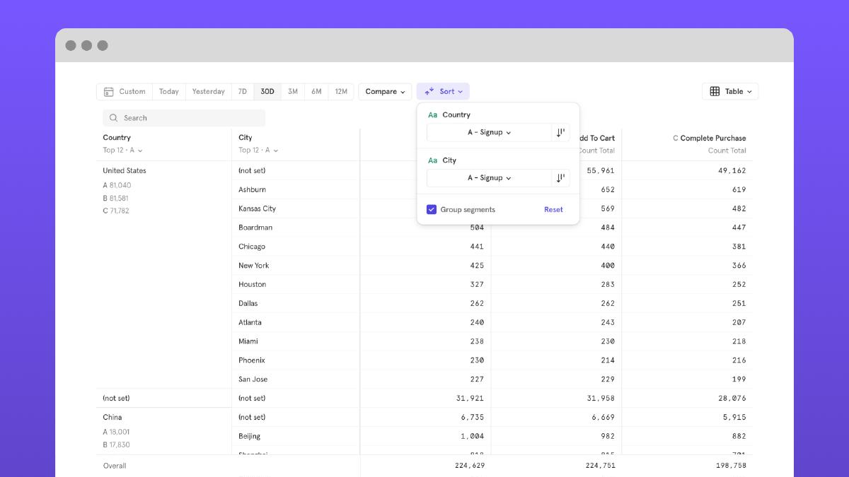
An all new sorting system makes it clear how the sort is affecting your table. It enables users to explicity sort a segment by a specific metric, sort by ascending or descending order, or even ungroup segments to see each top performing ones in one click.
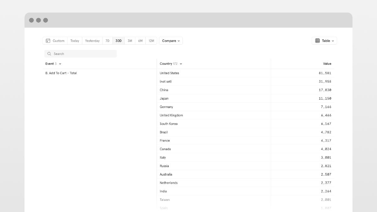
Improved segment visilibility control
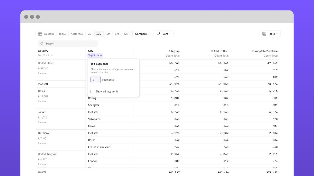
We improved the ability to focus on the segments that customers care about so they can narrow down on important segments when the segment cardinality is high.
Improved compare system
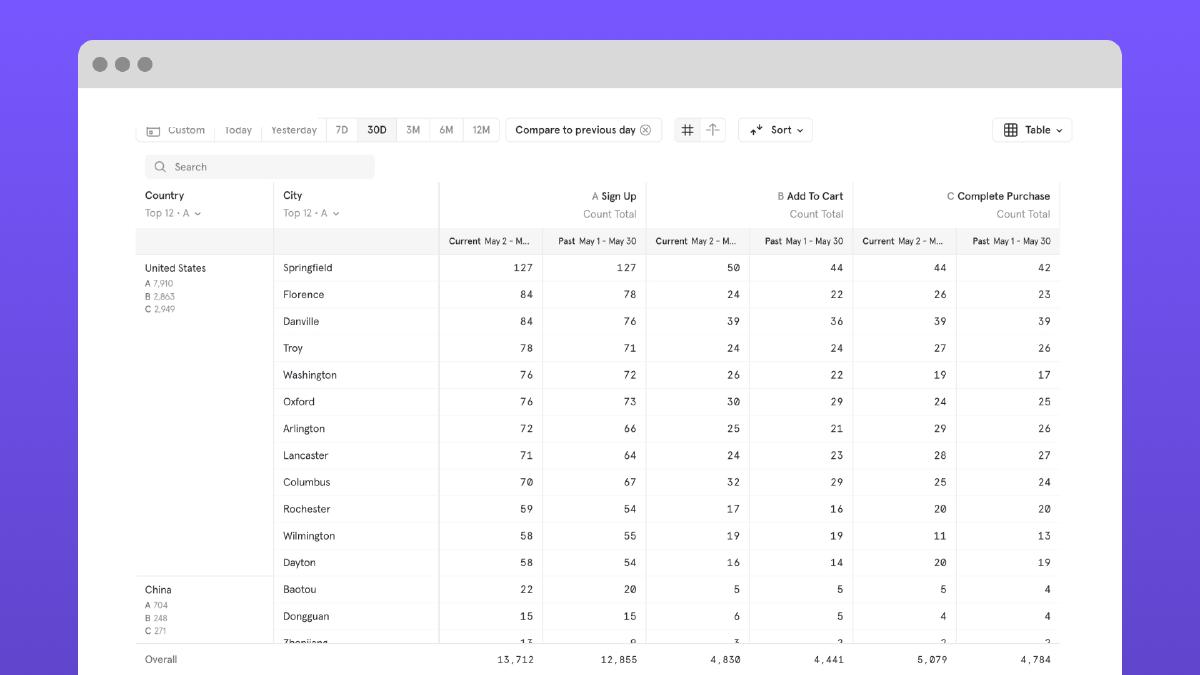
Building upon our side-by-side metrics solution, we also improved the ability to compare the current period of time to previous periods of time in order to track trends and growth in your product’s use.
Results
Increased active users
We increased active users count for both creators and consumers by a 2.7% and 4.1% lift respectively.
Increased saved table reports
We increased the amount of saved table reports from 0% prior to launch to 10% in 6 months.
Increased saved multi-metric charts
We increased the amount of multi-metric charts saved using breakdowns from ~25% prior to launch to 27.74% (11+% lift).
Reduced CSV exports
We reduced the amount of CSV exports down by 8+% after launch.