Project Astral
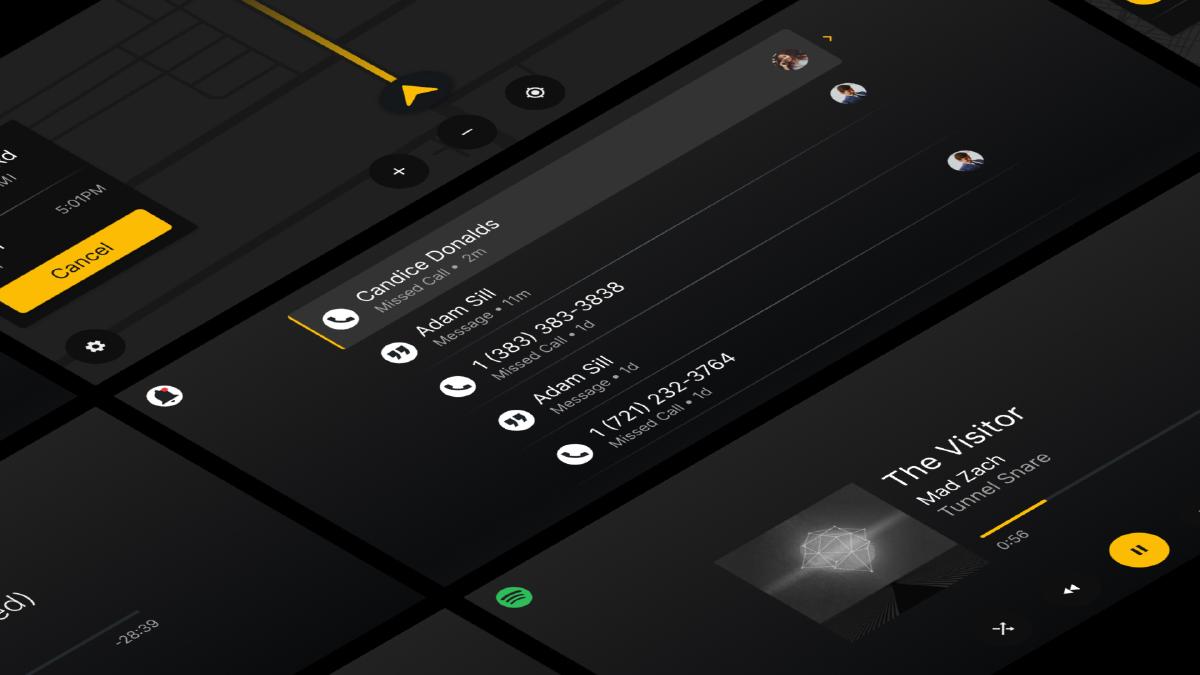
Re-imagining the next-generation infotainment system for a pioneering automotive OEM.
Overview
Technology advancements in the automotive space have enabled vehicles to become robust digital platforms. These advancements have brought the in-vehicle infotainment experience to the forefront of customer purchasing factors. I was part of an ambitious project to re-imagine how customers interact with their infotainment system in a start-of-the-art vehicle for luxury customers.
Confidential information has been omitted to comply with confidentiality. These designs are a reinterpretation of the original.
Problem
Industry trends and customer expectations have fueled innovation in digital display technology, resulting in larger digital displays within vehicles. While rectangular screens mounted on vehicle dashboards are more cost-effective to manufacture, they can obstruct driver vision and feel less elegant a solution the larger they become. Embedding displays into the vehicle dashboard can mitigate these issues but requires displays to sit further away from the driver and passenger. The added distance from the driver to the dashboard display leads to it resting outside of the acceptable ‘reach curve’ for vehicle occupants, which is a safety issue. Therefore, an alternative input method for interacting with infotainment content is needed.
Multi-Functional Controller
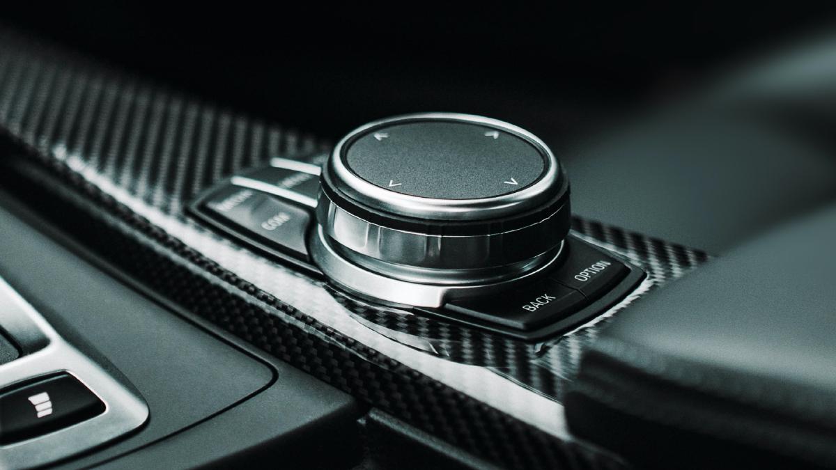
A cost-effective and reliable alternative to touch interaction within the in-vehicle environment is the multi-functional controller, enabling the vehicle occupant to engage with their infotainment system by tilting, rotating, and press actions. With this constraint, my team’s mission was to design the optimal interaction framework modeled around the MFC.
Challenge
How might we re-imagine multi-functional controller interaction that meets luxury customer needs and expectations?
My Role
My role as Product Design Lead was to define the vision for the interaction framework, collaborate with prototyping team members to build interaction prototypes for testing, work closely with UX Researchers to conduct usability tests and iterate on the framework, define specifications for software team execution, and then articulate the design vision to internal and executive stakeholders.
Process
Contextual Interviews
Contextual interviews provided valuable insight into the goals, objectives, and pain points of target customers.
Design Thinking
An early design thinking workshop helped with problem-framing amongst the design team and internal stakeholders.
Prototype
We built a fully interactive prototype to identify functional gaps in the design and provide an interactive demonstration to project stakeholders and research participants.
Usability Tests
We performed three task-based analyses to determine system usability and a comprehensive impression of user experience via a system usability scale (SUS) and user experience questionnaire (UEQ), iterating along the way.
Key Findings
We narrowed in on several key findings throughout our design research that we used to inform the final design of the interaction framework.
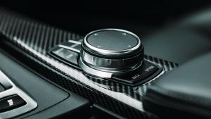
Cumbersome controller
People see the MFC as a suitable means of input, but find the conventional interaction paradigm associated with it cumbersome.
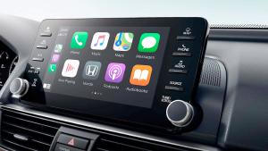
Better than projection
Customers expect their in-vehicle infotainment experience to exceed the convenience and ease-of-use of projected applications like Apple Car Play or Android Auto.

Map to mobile
Mapping MFC interaction to mobile paradigms increases learnability of system.
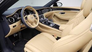
Luxury expectations
Luxury customers expect their in-vehicle systems to anticipate their needs in a contextually relevant way.
Solution
The solution is an infotainment system optimized for MFC interaction that maps to customer’s mental models of mobile gestures, anticipates the driver’s contextual needs, and empowers customers to customize the experience to fit their needs.
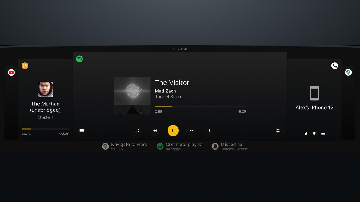
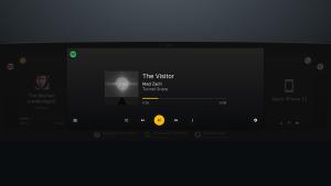
Primary App
The primary app sits center stage on the display and is where most user interaction is focused.
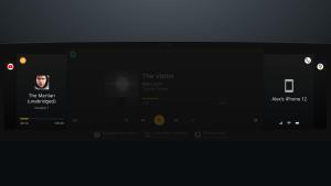
Secondary Apps
Secondary apps flank either side of the primary app (when available) and provide a high-level status for quick reference.
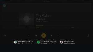
Anticipated Actions
Anticipated actions are displayed below the primary app to enable quick access and avoid obstructing app content.

Affordance
An affordance sits above the primary app to indicate what tilting the MFC up will do (close app or navigate back when in a subview).
MFC Interaction
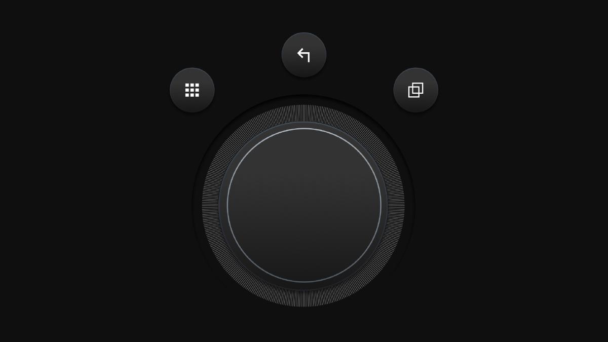
Tilt Left
Make application to left of current primary app in active app stack the primary app.
Tilt Right
Make application to right of current primary app in active app stack the primary app.
Tilt Up
Close the current primary app and make the adjacent app to the right the primary app.
Tilt Down
Move MFC focus to anticipatory actions (below primary app).
Rotate
Move MFC focus within single-level items (e.g. app controls).
Press
Engage with item that has MFC focus.
App Tray
Dedicated capacitive button that launches app tray.
Back
Dedicated capacitive button that returns to last view.
Modes
Dedicated capacitive button to display mode options.
Make interaction with the system feel effortless and familiar
People are intimately familiar with the gestures required to interact with their mobile devices. We built upon this mental model to increase the intuitiveness and learnability of the system.
Proximity
Reduce the cognitive load and driver distraction by only dipslaying controls and affordances upon MFC engagement.
Navigating Apps
Users can easily interact and navigate within the current active app by rotating the MFC and pressing it to select the focused control.
Switching Apps
Similiar to swiping horizontally to switch apps on mobile, users can quickly navigate between active apps by tilting the MFC to the left and right.
Closing & Opening Apps
Similiar to swiping up to close an app on mobile, users can quickly close apps by tilting up on the MFC. They can also launch apps by accessing the app tray via a dedicated button on the MFC and then selecting the app they’d like to open.
Notifications
Notifications display in the dynamic space below the primary app to avoid obstructing information while prompting users to interact when appropriate.
Meet luxury customers’ needs
Luxury customers desire to be catered to by anticipating their needs ahead of time. We can meet these needs by learning from past behavior and factoring in the current context to display timely and relevant actions.
Anticipatory Actions
Anticipated needs and eliminate steps through easy-to-access, contextually relevant actions which display below the primary app.
Empower customers with the customization
Customization empowers customers by giving them the control they expect to shape their experience and achieve their objectives
Modes
Display modes can be easily accessed and switched via a dedciated button on the MFC.
Results
While this concept did not reach production vehicles, it did manage to receive incredibly high marks in consecutive usability studies. Most importantly, this interaction framework successfully challenged the status quo of what multi-functional controller interaction with in-vehicle infotainment systems could be.
