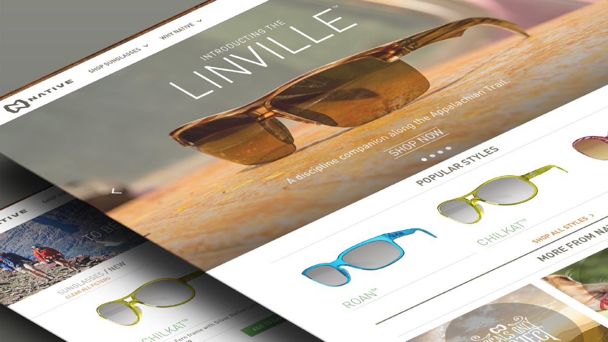
The New Nativeyewear.com
There are occasionally projects that come along and teach you so much that it takes a while for you to process all that your have learned. The redesign of Nativeyewear.com was very much this sort of project for myself and my colleagues. The following is an attempt to capture and reflect on the lessons I learned through the duration of this project and to highlight some key decisions that helped to make this a successful project.
1. Research
Like any project, we kicked-off things by digging in and doing some serious research. Doing your homework up front is not only crucial to understanding the goals and objectives of the project, but helps to build a solid foundation of knowledge that can be pulled from throughout the process. With that said, its important to have defined objectives for your research. Here are a few that we focused on:
Project Goals
Establishing the goals for a project early on is vital. We began by defining improvements that should be made over Native’s™ previous website in regards to functionality, content and maintainability.
Analytics
We made sure to pay close attention to the site analytics of Native’s™ previous website and documented key data that would help inform our decisions in the planning phase. This included data related to user devices, browser versions, and operating systems. This documentation would be prove to be invaluable.
Define Your Audience
During our initial research we also sought to define who was the target audience for Native’s™ product and engrain this into our thinking moving forward.
Inspiration
The research phase is a perfect time to really explore different approaches and get inspired. We spent a large portion of our research simply documenting web experiences that we really liked and were inspired by and then sharing them. By doing this our team began to collectively envision the possibilities which would serve as plenty of creative fuel moving into the next phase.
2. Planning
The next phase of the project was the planning phase. This was the most critical phase in the process because it would lay the foundation for the entire project moving forward. We made sure to really take our time and get the planning right by iterating over the following:
Site Map
We started by defining a general architecture for the website. By getting everyone in a room, working through this on a whiteboard, and then later refining and tweaking the site map, we were able to quickly define what pages and by extension what content we could expect on the website. This step was key in defining what the site would generally involve and also helped to establish a sense of collaboration between the client, our design team, and the development team early on.
User Flows
The next step was to define key user flows in order to clarify the journey that the user would take and to help our team really wrap our heads around the experience of the user. We quickly discovered that by spending time on user flows, important aspects that might not be initially considered became apparent.
Wireframes
The last step of the planning process was to dive into wireframes and begin to prototype the website’s general architecture. We decided early on to adopt a more interactive wireframe process — one that could be interacted with and would serve as a testing ground for ideas during the design phases.
View the Native™ Interactive Wireframes.
Mobile-First
We knew that we wanted to adopt a Mobile First strategy so that the end result is an experience focused on the key tasks users want to accomplish without the extraneous detours and general interface debris that litter today’s desktop-accessed web sites. The advantages to this strategy are numerous, but it means a slight shift in thinking — and also means it should be adopted early.
Collaboration
It is important to work collaboratively with not only your team, but other teams involved in the website from the very beginning — this includes the client, the development team, UX team, etc. We made sure to bring everyone to the table early on and then continually keep them involved by showing them progress. This approach keeps everyone invested in the project and instills a sense of ownership.
3. Design Exploration
The next step in our process was to begin a design exploration to establish general look and feel, which essentially would be done for client approval. While this was the least agile phase in the whole project, it was vital for the design team to be able to remain flexible and accommodate expectations on the part of the client and our project managers. We soon found a middle-ground where only a few key pages would be addressed for this purpose. Parallel to this step, we continued to refine our live wireframes and even use them to prototype interactions and features. During this phase, there were two key themes that we adhered to:
Stay Nimble
During the initial design exploration it is important to stay nimble and not get too tied to specific features or functionality. The purpose of this phase is to establish aesthetics.
Keep the Development Team Involved
It is paramount to keep the development team involved early and often — this includes even initial design exploration. A good developer will not only be able to spot potential issues but can provide insight and suggestions that will enhance the experience of the user.
Style guides are key: they allow designers to really refine design aesthetics, document all the states of a component like a button or a form input without bloating design files, and they serve as a constant reference for the design team which will help to keep design consistent.
4. Design Refinement
Upon client approval on a specific design aesthetic, we moved into the design refinement phase. This phase of the project was longest, and there were many moving parts. Going into this phase, we knew a few things we wanted to do: 1) Focus design around ‘templates’ instead of the more traditional and inefficient process of designing around every single page in addition to mobile and tablet designs, and to 2) create an interactive style guide to document and refine design components. We dove in after establishing these guidelines but quickly discovered a few key things:
Focus on one key component at a time
It is easy, when focusing on the larger picture, to oversee subtle but often crucial details of a specific component. Our team made sure to go back and to micro-focus on individual components throughout the site, and made sure we explored and evaluated all possibilities before deciding on an approach to that component. A great example of this would be the product modules on the main product pages: we explored every potential way to lay these out and weighed the implications of this before landing on a definitive solve.
Style Guides
Style guides are key: they allow designers to really refine design aesthetics, document all the states of a component like a button or a form input without bloating design files, and they serve as a constant reference for the design team which will help to keep design consistent. In addition to this, they are an immense help to the development team, which can use the style guide to pull assets and reference details established by the designers. An added bonus: they will come in handy for many projects to come!
5. Support
The final phase before launching the website was support and refinement. We continued to refine design components and address feedback while the development team took on the heavy lifting. It was important for us, as the design team, to stay involved with the development team and have regular check-ins after development sprints. These check-in served to address any feedback that the development team had. In addition to this, there were a few things we didn’t plan for that became key during this phase:
Things Will Change
There will inevitably be things that will need to change from the original designs, as any web project will have details that were missed in the initial stages. It is important to remain fully engaged and to be available to address any issues that might arise. Which brings me to the next thing:
Stay Engaged
The last phase of any web project is often hardest to stay as focused as you were in previous phases. It is important to keep in mind the project isn’t done (even after launch), and you must stay on your toes.
In Conclusion
The above is a breakdown of each phase throughout the project, but there were some themes that were constant in each phase. These are general points of advice that come in handy for any project.
Communication is key
The more you communicate with your team and other teams involved in the project, the easier it will be to effectively solve problems that arise.
Collaboration
The project’s success hinges on all team members taking ownership, and ownership is cultivated through collaboration. Collaborate early and often.
Be Proactive
During this project there were many times which being proactive and doing things without being asked to do them was very beneficial.
Never Settle
It can be tempting to settle on your first solve in regards to a UI component’s design when there is lots to do — always take the time to really think through key elements in isolation.
Stay Flexible
A key attribute that our team constantly exhibited was the ability to remain flexible. This is key because there will always be unexpected obstacles, and how you can adapt to them can determine the projects success.
Go with the Flow
There were times during the project when it was necessary to slow down and let other team members lead particular parts of the project. While it can be hard step back, it is part of the natural cycle of the project — if you go with the flow, things will go much smoother.