Design Principles for Reducing Cognitive Load
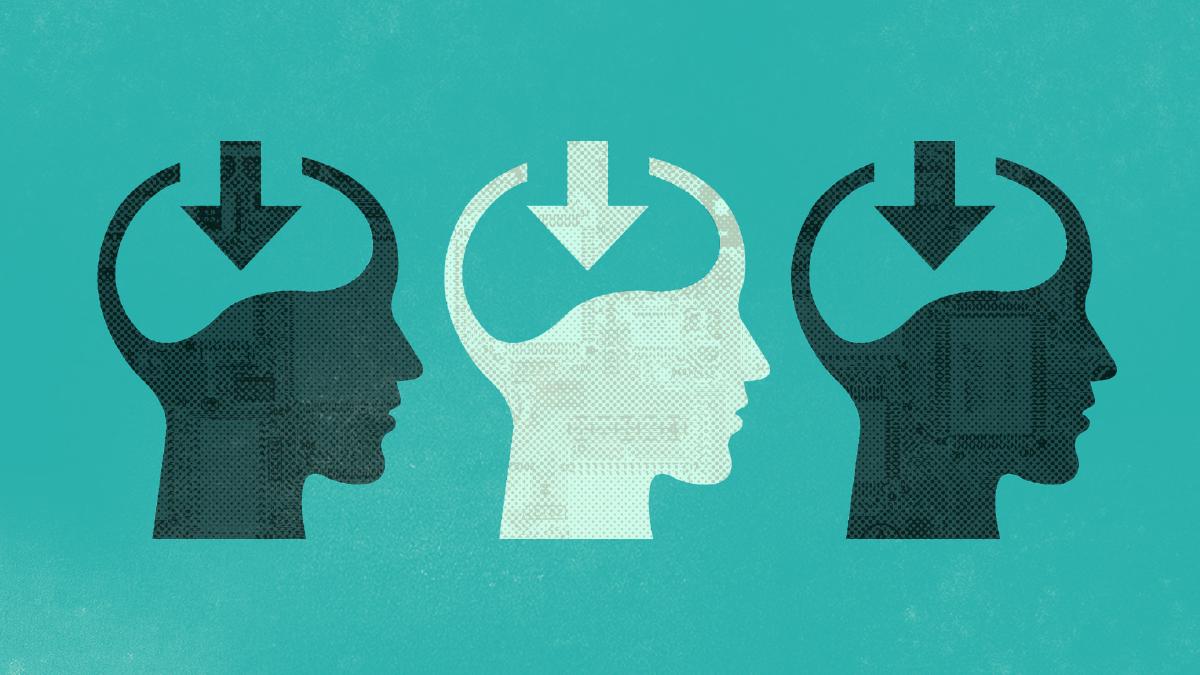
Every time you visit a website, a process of learning is initiated in the brain. Whether it’s the navigation, layout, or that auto-rotating image slider on the homepage, your brain has to learn how to use the site while keeping track of the reason you came there in the first place. The mental effort required during this time is called cognitive load. Now the catch: the working memory in which this information is processed and stored is limited. Your brain begins to slow down or even abandon the task at hand when it receives more information than it can handle. Although cognitive load isn’t entirely avoidable, designers must strive to manage and accommodate these limits.
What Causes Cognitive Load
To understand how to reduce cognitive load, we must first understand what causes it. Generally speaking, the causes of cognitive load can be traced back to three main factors:
- Too many choices
- Too much thought required
- Lack of clarity
Each of these factors will require processing and takes up mental resources that doesn’t actually help users understand the content.
Methods for Reducing Cognitive Load
Now that we know the factors that increase cognitive load, let’s take a look at how we can reduce it. This is by no means a comprehensive list, but instead a few common principles that can help inform design decisions.
Avoid Unnecessary Elements
Like everything in design, less is more. Any element that isn’t helping the user achieve their goal is working against them because they must process it and store it in working memory, alongside the things that will help them. Avoiding excessive colors, imagery, design flourishes, or layouts that don’t add value is crucial. But simplicity comes with a caveat: don’t overvalue it at the cost of clarity.
Leverage Common Design Patterns
By leveraging common design patterns when it makes sense, you are giving the user familiar elements which they already understand. This in turn reduces the amount of learning they need to do, thus enabling them to move right along and get closer to achieving their goal. My favorite sources for design pattern inspiration are Design Patterns on CodePen and the Blueprint Archives on Codrops.
Eliminate Unnecessary Tasks
Anywhere you are asking the user to read content, remember information or make a decision contributes to cognitive load. Whenever possible, it is good to shift these tasks away from the user and make it easier for them to stay focused on their goal. While it isn’t possible to remove all tasks, there is usually an opportunity to offload some task by setting defaults that can be edited, or leveraging previously entered information. Some companies are even taking this a step further with anticipatory design.
Minimize Choices
As previously mentioned, our working memory is limited. When confronted with too many choices, cognitive load will increase due to decision paralysis. It is important that we minimize the choices the user must make at any given moment, especially in places such as navigation, forms, and drop-downs.
Display Choices as a Group
When choices are split into separate groups and hidden, users often mistake the options that are visible as the complete group. This means that users are likely to never find the additional choices, which not only limits what is available to them, but also makes it more difficult to decide on which option to select because they are not aware of the alternatives. Therefore, it is best to eliminate the resulting cognitive load by always displaying choices as a group.
Strive for Readability
Making our content legible isn’t enough — we need to make it readable. This means our typography must be aesthetically pleasing, appropriate for the content and easy to read while design remains relatively invisible. By doing this, we can ensure there are as little distractions as possible for the user, which results in a better understanding of the content by the user.
Use Iconography with Caution
Research has shown that iconography can be hard to memorize and, contrary to intuition, can increase cognitive load by requiring mental processing to infer meaning or recognize. While universally understood icons work well (ie. print, close, play/pause, reply, tweet, share on Facebook), most are subject to the user’s understanding based on previous experience (in which there is no standard). When leveraging the power of iconography, it is best to accompany them with text labels to communicate the meaning and reduce ambiguity.
By following the principles above, you can drastically reduce the user’s cognitive load and ensure their attention isn’t being wasted on elements that do not help them. It is important to remember that the user has a goal, whether it is to buy a product, understand something or simply to learn more about the content. The less they have to think about what they need to do to achieve their goal, the more likely it is they will achieve it.