Designers Guide to Web Performance Optimization

Performance is one of the biggest issues we face on The Web today. As the weight of the average page continues to rise, discussion around performance on most web teams quickly descends into the realm of development optimization. The reality is that performant web experiences begin with treating performance as an essential design feature. In this article, we’ll be looking specifically at ways that designers can help to champion and prioritize performance.
Why Performance Is Important
Web performance optimization is important because it directly impacts user experience and page metrics. You can pack as many micro-interactions, animations and beautiful images you want into a page — if the page is slow, the user will likely never see them. This is exacerbated by connection speeds on mobile devices, which is now the predominant method people all around the world are accessing the internet. All to often, we tend to forget that the fast internet connections we enjoy while designing experiences for the web is not the norm for those whom will visit it.
The road towards better performance doesn’t start with developers or technology stacks (though I’m certainly not suggesting those things are unimportant). It begins with a shared interest on everyone’s part in making a product that’s lightning fast.

Process & Workflow
By prioritizing performance and making it part of our workflow and process, designers can help to make performance an essential design feature. We must shift to emphasize performance, instead of tacking it on at the end or leaving it up to the development team.
Shift Your Perspective
It is pretty common for designers to jump right into designing for ‘desktop’ and then work their way down to ‘mobile’ when exploring design concepts in high-fidelity. This is a mistake because it fails to consider viewports that fall in–between common viewport sizes, or viewports that are on the extreme ends of the spectrum (like TVs). As a result, this failure of consideration can be problematic in development and result in half-baked solutions.
Secondly, it’s more effective to think in terms of the smallest viewport first, which helps prioritize content and features by forcing us to consider what’s important from the very beginning. This ‘mobile-first’ mentality goes hand-in-hand with progressive enhancement, or adding layers of enhancements to a solid foundation in order to deliver an accessible experience to all users.
Collaborate
One of the most effective steps a designer can make is to simply involve the developers in the design process as early as possible. The insight that developers will provide is invaluable, and it will help to ensure design decisions are being validated up front.
If discovery whiteboard sessions are part of your process, then development team members should be in room. When your team reviews wireframes, sitemaps or design mockups, then developers should be right there in the mix. And finally, when anything is being shown to the client, the development team should be represented.
Another benefit of collaborating closely with development team members is the ability to build prototypes and identify performance bottlenecks early. Design comps cannot tell us how much that banner image or additional font will affect page speed on a 3G connection. With prototypes, we can spot potential issues and make design decisions in the appropriate environment sooner.
Sticking to a Budget
An effective method for keeping page size in check is to set a budget up front. Commonly referred to as a ‘performance budget’, this approach requires first identifying a page weight limit early on, and then ensuring that the total weight of assets on the page doesn’t exceed this limit.
You’ll need to work closely with development team members to both identify and track this, but the end result is well worth it. Not only will a performance budget help to set some boundaries for you in the design process, but it will help to ensure that every design decision being made must happen with performance in mind.
Avoid One-Off Solutions
It’s all too easy to create one-off solutions that abandon patterns established elsewhere in your system for the sake of solving a particular problem. What you don’t see when you do this is an increasingly bloated code base that will ultimately affect performance (not to mention increased difficulty in maintaining or extending the code in the future).
A better approach is to avoid one-off solutions by thinking of your designs as systems of components which make up a whole. If you find yourself creating a one-off solution that isn’t likely to be leveraged elsewhere, it’s time to consider reusing or modifying a pre-existing component or pattern you’ve already created.
Even better, consider starting with a style guide and use it to lay the foundation for all UI solutions.
Further Reading & Tools

Animation & Effects
Enhancements such as animations and effects can add a lot to the users experience, but can also take a toll on performance. To find a balance, we must weigh the value these enhancements add to the experience with the costs at which they come.
Meaningful Animation
Animations can improve the user experience by providing context, visual cues, anticipation and functionality. They can also be misused as a means of embellishment. All too often, I hear of animation being used to ‘enhance’ an interface, when instead it’s simply meaningless motion with no purpose outside of being flashy. Using animations in this manner can not only impede usability and understanding, but it can also have a negative impact on performance. Good animation is invisible and provides meaning for the user, as opposed to animation for the sake of animation or because it’ll look great for your next Dribbble shot.
Scroll Effects
A good design rule of thumb in general is to have a purpose behind every single design decision. This means when we intend to have parallax, scroll-jacking, or animation effects happening as the user scrolls the page, we better have a good reason. Doing anything that fires on the scroll event can be costly, especially when it isn’t properly implemented — not to mention annoying for the user.
Further Reading

Fonts
While web fonts are awesome, they must be used with caution. This is because they not only contribute to the overall weight of the page, but can also block rendering of text on the page.
Limit Fonts in Use
Each weight and style of a typeface that you decide to use is a separate web font that results in a server request. The simplest way to mitigate this is to keep custom web fonts to a minimum. While this isn’t necessarily a design best practice specific to the web, limiting the fonts in use is even more pertinent here. A general rule of thumb is to not exceed 2-3 web fonts per page and to use web-safe fonts whenever possible.
Choose Wisely
Not all fonts are created equal. It’s important that the fonts you choose have been optimized for web use, i.e. they’ve been hinted, they render as expected cross-browser, and they’ve been subsetted to contain only the necessary glyphs in order to reduce file size.
Formats
There isn’t a single format that works in all browsers. As a result, we must define multiple formats and let the browser choose the one it supports in order to provide a consistent experience. When doing so, don’t forget to provide font formats that are designed to be more performant, like WOFF 2.0. Browsers that support this format can leverage its advantages, which browsers that don’t will fallback to a format it does support.
Fallbacks
Since custom web fonts can delay the rendering of text on the page, it’s important to have web safe alternatives ready. This will help to ensure that text can be rendered as soon as possible, and then progressively enhanced to make use of the custom fonts when they are available.
Further Reading

Images
Images are by far the biggest contributor to page weight in most circumstances. While there are some significant ways developers can ensure that the footprint of images is as small as possible, the best way to avoid them weighing down pages is for designers to plan accordingly.
Use Sparingly
The best method for avoiding images from weighing down the page is to only leverage them when they provide value beyond what a simple icon or well-written piece of copy would provide. In other words, use images sparingly and for maximum effect — while a picture is worth a thousand words, it can also contribute to poor page performance and ultimately a high amount of user abandonment.
Choose the Right Format
Simply choosing the appropriate file format for an image can have a significant affect on page load. While JPEGs have a tendency to compress better and result in lower file sizes, they lack alpha channels and therefore cannot contain transparency. PNGs on the other hand have the ability to contain transparency, but can easily weigh 3x the size of JPEGs.
There are also new image formats that provide even smaller file sizes, but lack wide support by browsers. The WebP image format proposed by Google promises superior lossless and lossy compression, but browser support necessitates developers implementing fallbacks in order to leverage them. There’s also the JPEG 2000 format, which has even less browser support. If you’d like to leverage these image formats for optimal file sizes, be sure to take into consideration browser support and your users, as we’ll as work with your development team to ensure the proper fallbacks are in place.
A note on JPEGs: When exporting out images as JPEGs, it’s a good idea to save them as ‘progressive’. This will ensure the image is rendered in browsers that support this feature as increasing sharp layers until the image is fully loaded, as opposed to rendering loading it from top to bottom.
Responsive Images
A relatively recent feature in front-end web development is the introduction of responsive images, which are images that adapt in response to different environmental conditions. These adaptations can include, but are not limited to, changing the dimensions, crop, or even the source of an image. Such attributes allow developers to define an array of images, and then either define (with the ” element) or allow the browser to choose (via ’srcset’ and ’sizes’ attributes) a more appropriate image based on the users conditions.
As designers, we can facilitate the use of responsive images by first identifying the various image sizes that will be needed, and then outputting these assets for development. This process can be a bit tricky at first because you must know your breakpoints in order to determine the right image dimensions, and also take into consideration higher resolutions screens. I’ve written an article that outlines how I like to identify and consolidate these values, which you can find here.
Optimization
An asset that isn’t optimized for the web does’t belong on the web — this is especially true for images. Don’t just assume assets will get optimized in development. Instead, it is our responsibility to ensure proper assets are delivered. By leveraging tools such as ImageOptim and ImageAlpha, we can significantly reduce file size by removing necessary image data while preserving the overall quality of the image. These post-optimization steps should of course following saving the image out in your design program of choice ‘For the Web’.
However, image optimization isn’t limited to compression. Another method for optimizing images is to blur sections of the image of lesser importance while preserving the focus on key areas. Additionally, you could convert the image to greyscale to reduce color information, which can have a noticeable impact on file size.
Further Reading
- Designing for Performance | Optimizing Images
- Google Web Fundamentals | Optimizing Images
- Compressor.io

SVG
SVG, or scalable vector graphics, offer many advantages over their raster counterparts. Not only are they resolution agnostic, i.e. they can scale and look great at any resolution, but they also can be applied directly on the page. This eliminates the need for an additional server request, and ensures they can be highly compressed with the page content.
Know When To Use
There are a few things to keep in mind when using SVGs on the web. The first thing is to know when it’s appropriate to use SVGs. SVGs are great for vector-based 2-dimensional graphics such as icons or even complex illustrations. On the other hand, SVGs are not appropriate for photographs.
The next thing to consider is browser support, which varies depending on how the SVGs will be implemented. The best bet here is to work closely with your development colleagues to determine the best approach.
A Note on SVG Animation: An added benefit of SVG that you don’t have with images (aside from GIFs, which are on average much larger in file size) is programatic control over the entire or individual sections of the SVG. This means you can animate them, and there are various methods of doing this. Each method of animating SVGs comes with own pros and cons, so be sure to test in various browsers and devices when using them.
Optimization
SVGs can be compressed alongside page content via server compression methods like gzip, but they should also be optimized beforehand. The reason for this is that SVG files can often contain extraneous data that doesn’t affect how the icon will appear in the browser (in many cases, it’s simply there as an artifact from the design program in which it was created). It’s a good idea to run your SVGs that are being used in your designs through an optimization tool before handing them over to development, and there are plenty of great tools to help with this (check out below).
Further Reading & Tools

Perceived Performance
Perceived performance, or the speed at which users perceive a website to be, can play a crucial role in user satisfaction. There will inevitably be instances in which site performance isn’t ideal due to conditions beyond our control, like network latency or intense server processing. However, we can plan ahead and design for such instances by creating the illusion of speed and responsiveness.
Provide Feedback Instantly
Perhaps the most frustrating part of a slow web experience is when you perform an action, but it isn’t clear whether or not the action was successful for even received. This issue can be mitigated by designing interfaces that provide instant feedback, while optimistically processing the action in the background. As a result, we can ensure processing isn’t delaying the feedback that users need, and the experience feels smooth and responsive.
Placeholder Content
Another technique for increasing perceived performance is to populate the page with placeholder content by default and then allow this content to be replaced with actual content once it’s been loaded. This will create the illusion that something is processing, and as a result the user is willing to wait longer for their content. This approach is arguably better than displaying loader elements in place of content because it feels like content is being loading faster.
Further Reading
Conclusion
Web performance optimization isn’t something we can tack on the end of our processes or assume is handled with development. Fast web experiences start in the planning and design phase, and as designers we must champion it on our teams and incorporate it into our processes and workflows. After all, good performance is good design.
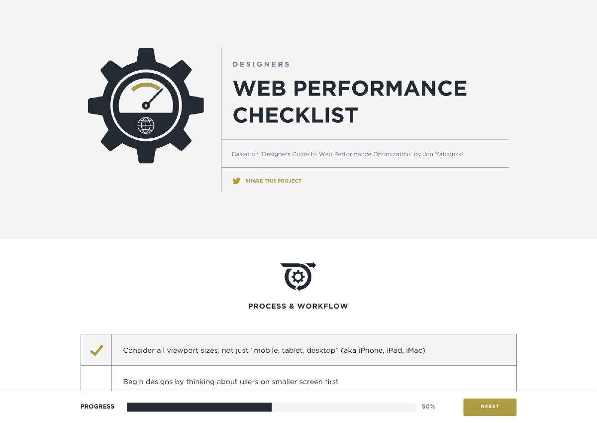
Designers Web Performance Checklist
I’ve created a project checklist which reflects the techniques outlined in this article, which you can find here.


