Redesigning the Web Field Manual
Redesigns are a great opportunity to re-evaluate an experience, learn from how users are actually using it, and then optimize the design to improve it. They can also be a way to experiment with different interaction patterns, design aesthetics, or both. I recently got the opportunity to do all of the above with a side project of mine called the Web Field Manual. Here’s a recap of what I learned along the way, and some insight into various aspects of the redesigned experience.
History
The Web Field Manual was first launched in May, 2014. What began as a post-conference presentation for my colleagues quickly evolved into something I thought would have a slightly longer shelf life: a website that highlighted not only the key take-aways from the conference, but also related reading organized by category. The project was quite successful upon launch and promptly became a labor of love that I have continued to update on a weekly basis since.
Over the last three years, I’ve experimented with different types of content, as well as incremental adjustments to the overall design, but no major overhauls since the initial release. The time had come for me to consider what the future of the Web Field Manual would be moving forward, and what a redesigned site would look like. I collected inspiration and articles for the better part of a year before starting, and this provided the research I needed to outline how I wanted to move forward.
Content
The content on the Web Field Manual has grown throughout the lifespan of the project. I’ve had the opportunity to try different ideas, some of which worked really well, and some of which were fun but didn’t evolve how I’d hoped. So with the fourth release, I decided to do a site-wide audit and purge anything that didn’t get updated on a regular basis. A ‘back to the basics’ release, I guess you could say.
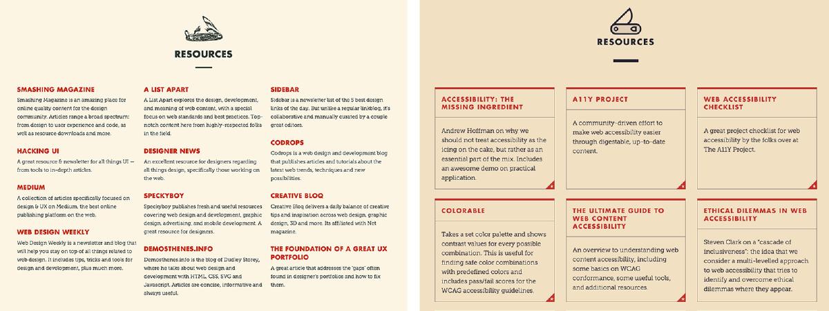
Resources
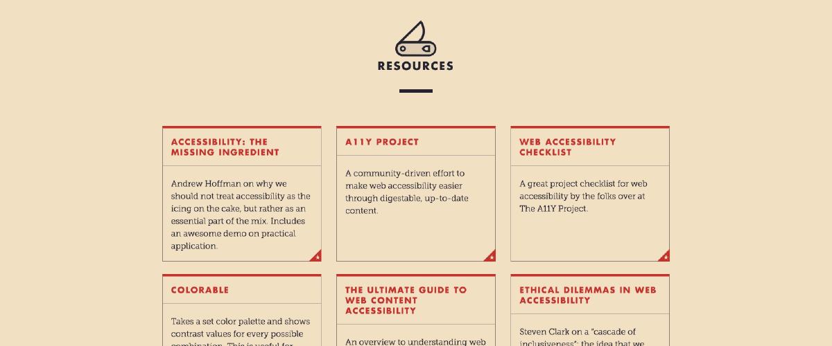
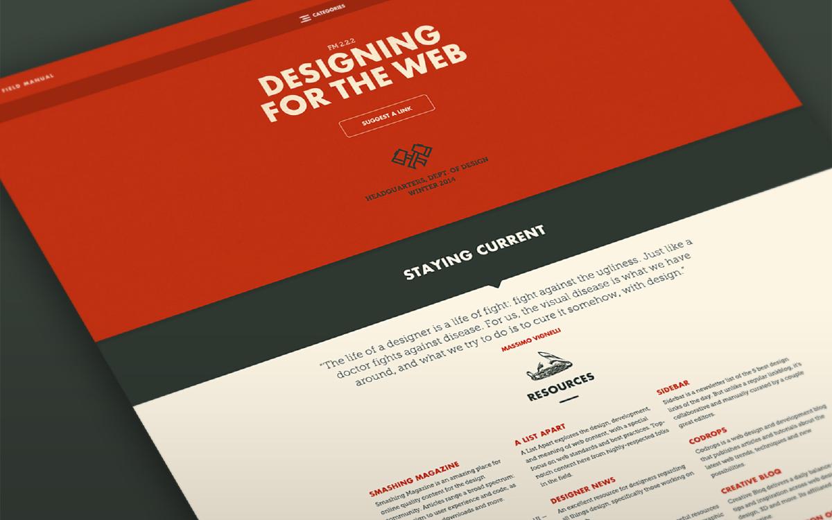
The resource links have always been the meat and potatoes of the project. These links have been added on a regular weekly basis since the initial launch in 2014, and audited periodically to ensure they remain relevant. The site initially only had ‘Design’ resources, but this quickly grew to also include ‘Code’ resources separated on a new page.
Tools
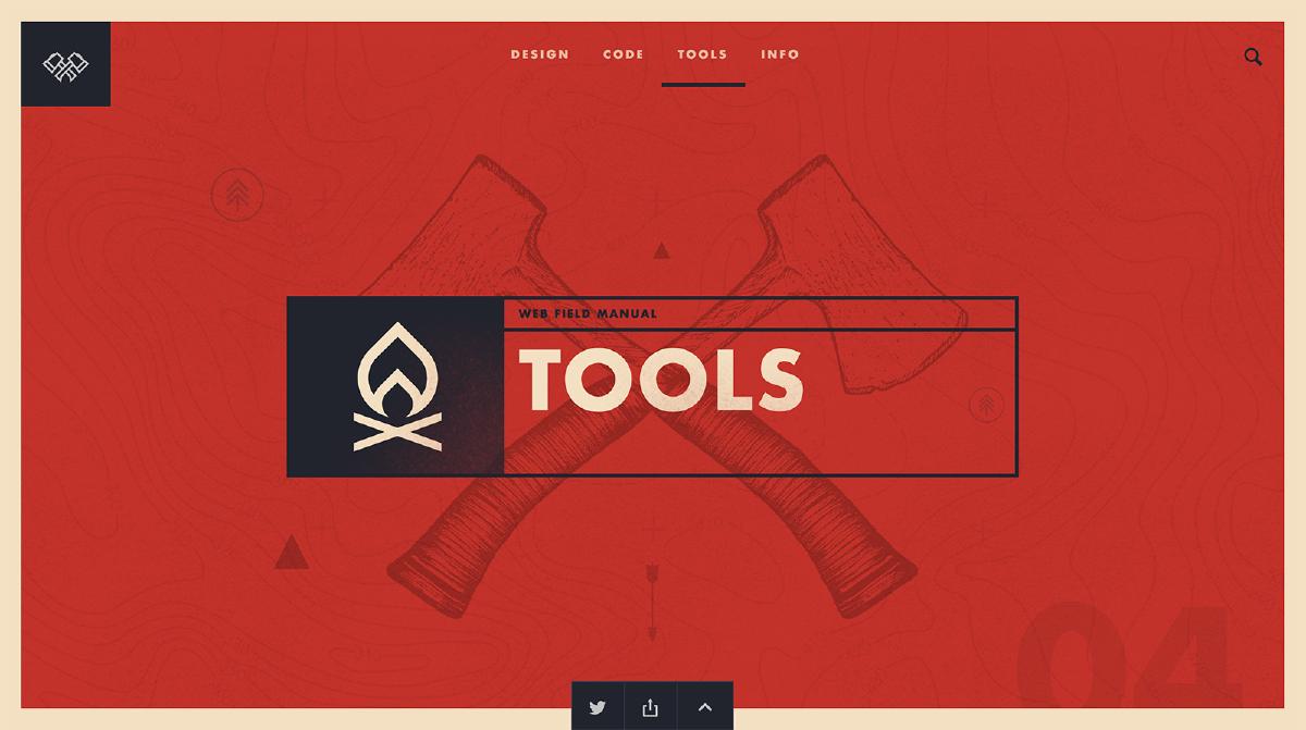
The fourth release of the project includes a new section called ‘Tools’. The mission of this new content is to provide small, single-purpose helper tools for designers and developers that are focused on common tasks. I’m very excited about this new section: not only will it be a great value to us that are building digital experiences, but it provides a lot of opportunity for me to grow while building these helper tools. These projects require a decent understanding of Javascript to work in the browser, and this is admittedly an area I’d like to continue and strengthen.
Search
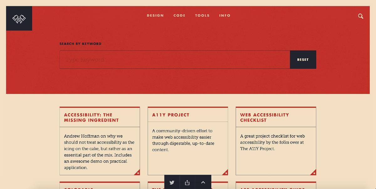
Lastly, there has been the need for search functionality on the project for a while. The content has grown to the point where the ability to search by keyword would be incredibly helpful. So partly for convenience and partly for necessity, the introduction of keyword search is now available on the project. I think this addition is a big improvement to the site, and will definitely help in finding specific content easily.
Auditing
The initial site release also included “Do’s and Dont’s” that were displayed along with resources, broken down by category. My vision for these tips were to provide some high-level insight pertaining to each category — sort of like a TL;DR. Over time, these tips didn’t get updated very often, and more often than not seemed like an add-on. The same applied to the ‘Guides’ section, which was a fantastic idea but didn’t get quite the amount of traction I wanted. So I decided to drop these for the forth release and see how things go.
UI
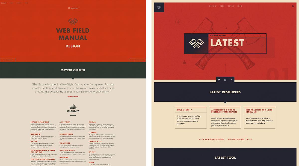
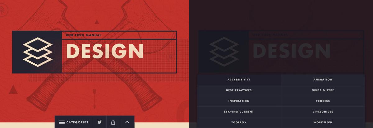
The latest release of the Web Field Manual includes the biggest evolution of the design since the initial version. What started as very utilitarian design has evolved to being a little more layered and playful, while still of course being purposeful.
Aesthetic
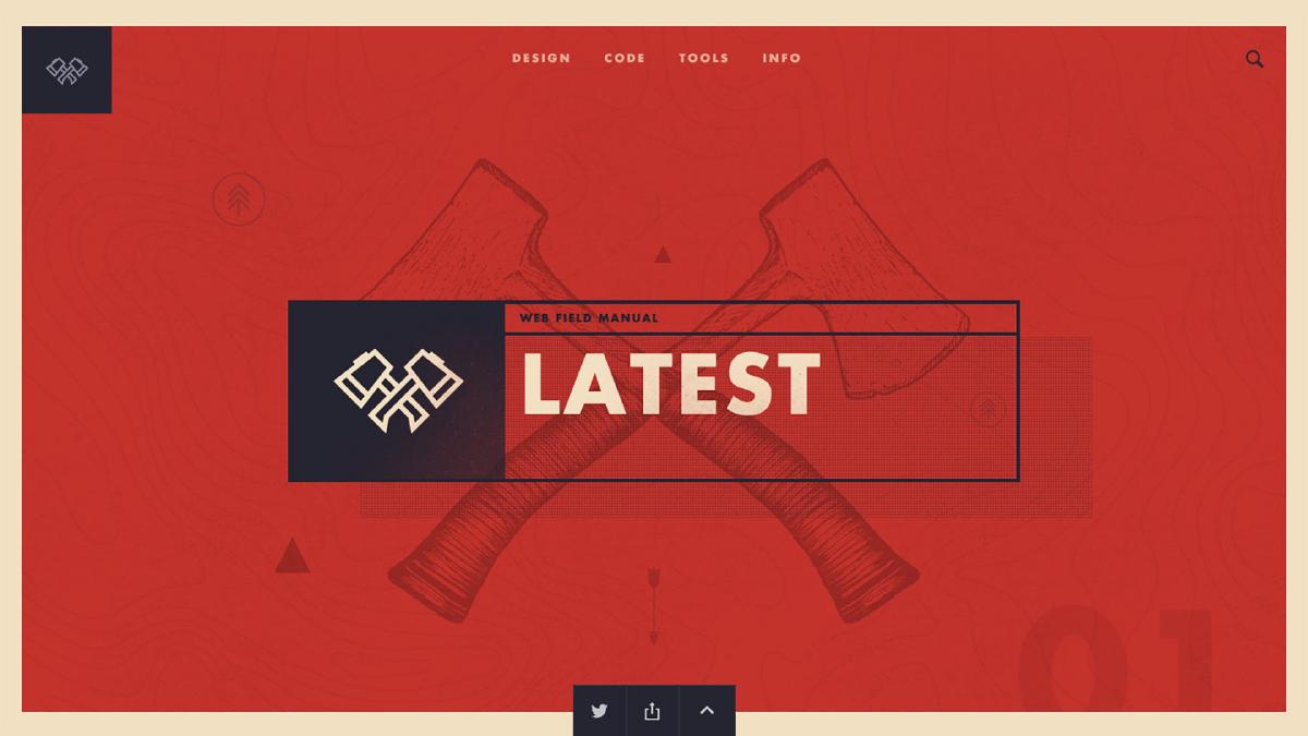
The design aesthetic of the project has evolved in parallel with the content along the years. While there’s always been a playful ‘campiness’ to the site, the UI has been grounded and not too flashy, with a priority always placed on functionality over form. This reason for this is because the content must be scannable and users should be able to find resources quickly. If the aesthetic of the site gets in the way, then the site has failed to fulfill its primary goal.
But the Web Field Manual is also a passion project of mine, and therefore it’s sometimes necessary to have a bit of fun in order to stay engaged. I had been collecting inspiration for the better part of a year, and with this recent redesign I decided now was the time to push the design aesthetic a bit more. One aspect I really wanted to push was a more layered look that could come alive while the page scrolled, but say out of the way when it comes to the primary content (more on this later).
Color Scheme
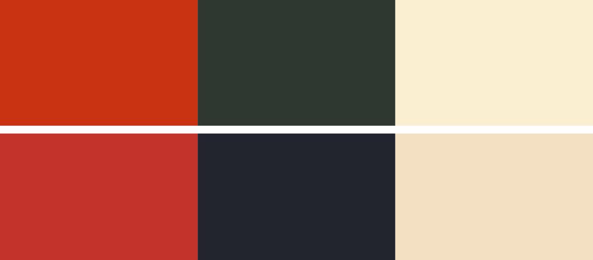
The color scheme of the initial release back in May 2014 could best be described as saturated yet subdued. The primary colors were a dark red and a heavily desaturated dark blue. These colors shifted toward being more muted by brining down saturation levels, and increasing the saturation of the base off-white.
Iconography
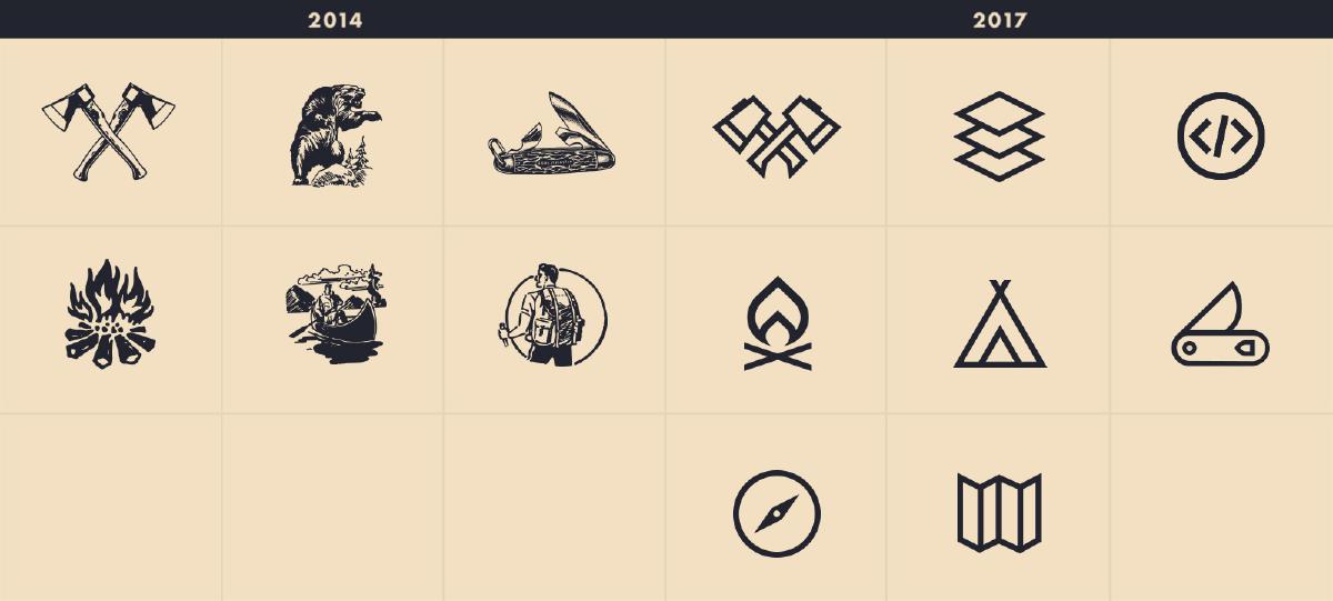
The iconography on the project is the one design element that has perhaps evolved the most. All original iconography was created by the extremely talented Geoff Tice, was a prominent element in the initial site release. With the second release of the project, a refined logo was introduced by design maverick Garrett Wieronski, and over time the iconography would evolve to be consistent with the logo.
Typography
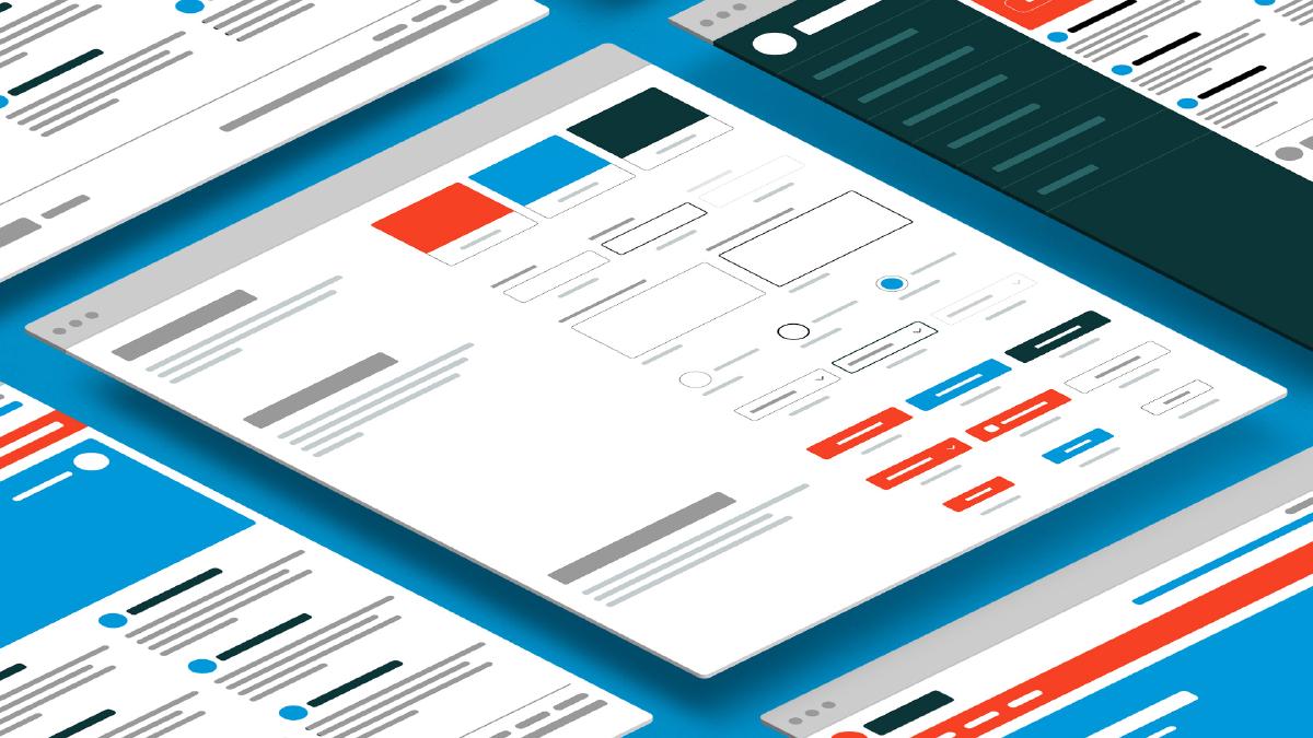
The typography on the project has remained the same since the initial release. I’ve explored many different variations, but have always came back to the combination of Futura Bold for Headlines and Museo Slab 300 for body text. There’s something about this simply combination that is versatile and has formed the backbone of the design system for the Web Field Manual. Futura is an all-time favorite typeface and can make things feel very classic or vintage. When juxtaposed with Museo Slab, there is a great vintage meets modern aesthetic that really comes across the screen.
Animations & Transitions
Motion can add an incredible amount of magic to any experience, but they can also be used functionally to providing context and meaning to the user. I wanted to explore how animations & transitions could be leverage beyond the standard changes on mouseover to breath some life into the site. From page transitions to subtle adjustments to what’s visible while scrolling, I took the time to really consider how subtle uses of motion could transform interaction on the site and provide more meaning. The result is an experience that feels more fluid, responsive to user interaction, and far less jarringly when moving from one page to the next.
UX
Improving the user experience throughout the site was a primary objective. The following were a number of key areas that were identified as needing some adjustment or total refactoring.
Card Pattern
Resources throughout the site have always been displayed as a lists, which made sense when there were a smaller amount of items per category. Over time, the amount of items has grown, and with it the need to improve scannability. By leveraging the card pattern to display each resource, we can ‘chunk content’ by providing distinct boundaries for each item, and therefore increasing scannability significantly.
Category Navigation
The category navigation is a key component on the Web Field Manual. This component allows for uses to access and navigate to specific category sections on resource pages. Therefore, it must be easily accessible when needed, but not too obtrusive to distract from the primary content on the page.
This component has undergone significant change on each release of the project, with each variation attempting to balance ease of use and discoverability while trying to avoid becoming too distracting.
The latest variation of this component was born from the desire to move it from the primary header area to somewhere less prominent, but keep it easy to access and retain it’s discoverability for the user. By centering the component toggle at the bottom of the viewport and making it available when the user has landed on the page, or when they are scrolling up (more on this below), the component could achieve these objectives easily. This took a bit of trial and error and the feedback that my fellow designers provided me was invaluable. Eventually, I landed on a solution that I think works well and has the right balance.
Auto-Hide Sticky
Last but not least is a key piece of functionality: the auto-hide sticky pattern. This interaction pattern allows for key UI to be displayed by default but hidden as the user scrolls the page, and then revealed with the user scrolls up or lands at the bottom of the page. It is incredibly useful because it allows the user to focus on the tasks at hand: focusing on the content while scrolling, but remaining easily accessible when the user is likely to be looking for navigation.
Both the header/navigation and utility bar (which includes the category navigation) benefit from the functionality that this pattern provides. It is an excellent pattern that helps to keep the user focused and reduce the visual clutter that they must cognitively manage while interacting with the site.
While redesigns can be time-consuming and exhausting, they can also be incredibly rewarding. I learned a lot from this redesign that not only improve the experience, but will help inform designs on other projects in the future. I look forward to continuing to evolve the project and the value it provides to the community.