CSS Accordions
The content accordion: a design pattern that is fairly ubiquitous on the modern web. Traditionally this sort of thing has relied on Javascript, but developers are increasingly able to use CSS for components such as these due to the introduction of advanced selectors, transitions and animations. If your target browsers support these advanced CSS properties, then you also have the option to rely entirely on CSS for this design pattern. The following is a deep-dive into the various techniques you can use when building a content accordion, as well as a few pros and cons associated with each approach.
CSS content accordions are not new but until recently they had to rely on the :target pseudo-class. This did the trick (to an extent) but came with numerous drawbacks, including the inability to have multiple expanded panels or the ability to toggle the same panel open and closed. Another nasty side-effect of this approach is that after interacting with the accordion and then hitting back button in the browser, it would toggle the last state in your accordion instead of navigating you to a previous page.
This is where the :checked pseudo-class comes in. By using the [:checked pseudo-class](:checked pseudo class” href="https://developer.mozilla.org/en-US/docs/Web/CSS/:checked) instead, these issues are no longer a problem. Browser support for this selector is not as deep, but non-supporting browsers such as Internet Explorer 8 are losing fans very, very fast. For Internet Explorer 9+ and all modern browsers this selector is fair game. So, let’s get started!
Technique 01: Radio Input Hack
The premise of this technique is to utilize a hidden radio input and a corresponding label tag. The label tags will serve as the headers for each panel within the accordion, and when clicked will give it’s hidden input a ‘:checked’ pseudo-class. Once an input has this class, we can use an adjacent sibling combinator to apply ‘conditional’ styles to the next element. In our case, this next element will be our accordion content.
We start with our markup which is made up of our parent container, and then each panel consisting of a radio input, a corresponding label tag, and then finally the content for that specific panel in the accordion. One important thing to note is that each panel in the accordion is wrapped in a div (it will become apparent why this is soon):
<div class="accordion">
  <!-- Panel -->
  <div>
    <input type="radio" name="panel" id="panel-1">
    <label for="panel-1">Panel 1</label>
    <div class="accordion__content">
      <h2 class="accordion__header">Header</h2>
      <p class="accordion__body"></p>
    </div>
  </div>

 <!-- Repeat for Additional Panels -->
 <div>...</div>
</div>
Next up is to apply the CSS, which will enable the accordion behavior we want:
/* Basic Accordion Styles */
.accordion {
/*
* Hide radio input
*/
input[name='panel'] {
display: none;
}
/*
* Basic Label styling
* 1. Apply relative positioning for absolute positioned toggle indicator
* 2. Ensure cursor is a pointer
*/
label {
position: relative;
display: block;
cursor: pointer;
/*
* Label toggle indicator: normal
*/
&:after {
content: '+';
position: absolute;
right: 1em;
}
}
/*
* Label toggle indicator: toggled
*/
input:checked + label {
&:after {
content: '-';
}
}
/*
* Basic panel content styling
* 1. Hide content
* 2. Apply relative positioning
* 3. Apply transition property for smooth toggling
*/
.accordion__content {
overflow: hidden;
height: 0px;
position: relative;
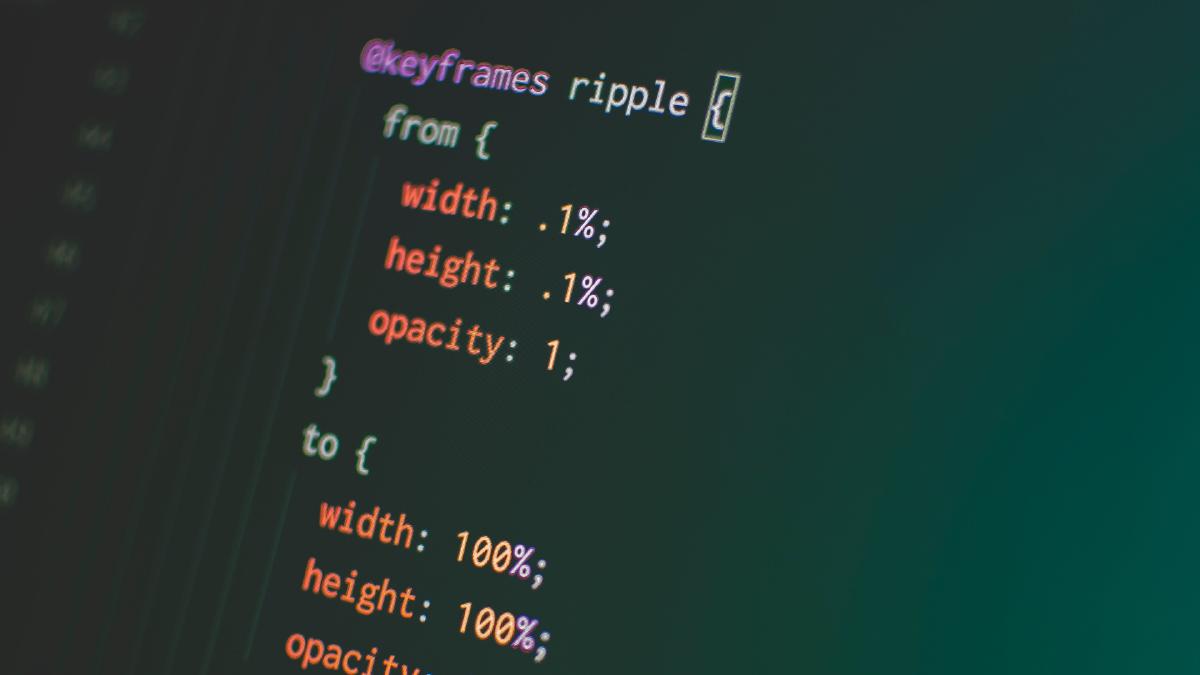
transition: height $timing $ease;
}
}
input[name='panel']:checked ~ .accordion__content {
height: 150px;
}
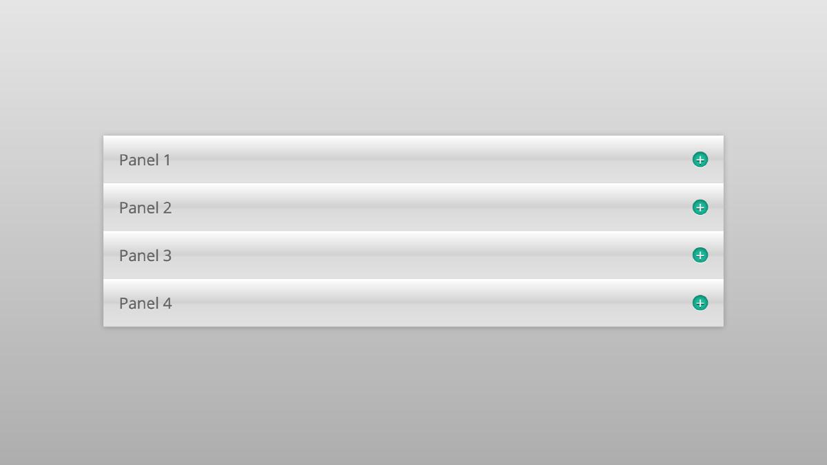
This is the basic CSS that will enable the accordion to work properly. By adjusting the height on the panel content, we are able to animate that content open using the adjacent sibling selector on your hidden radio input. The div’s which wrap each panel will keep the any panel content outside of the one the user has toggled from opening. With some extra styling, you can quickly have a CSS-only content accordion:
Advantages:
- An open panel will close when another has been opened, therefore keeping the amount of visible content limited.
- Panel animations can be fully controlled.
Disadvantages:
- The panel content must be set to a fixed height and must be maintained in order for content not to overflow the container.
Technique 02: Checkbox Hack
The checkbox hack technique is identical to the radio input technique above, but instead uses checkbox inputs as opposed to radio inputs. Therefore, the only difference in regards to code will be the markup:
<div class="accordion">
  <!-- Panel -->
  <div>
    <input type="checkbox" name="panel" id="panel-1">
    <label for="panel-1">Panel 1</label>
    <div class="accordion__content">
      <h2 class="accordion__header">Header</h2>
      <p class="accordion__body"></p>
    </div>
  </div>

 <!-- Repeat for Additional Panels -->
</div><!-- .accordion -->
Here is our more styled output:
Advantages:
- The ability to toggle multiple panels open.
- Panel animations can be fully controlled.
Disadvantages:
- The panel content must be set to a fixed height and must be maintained in order for content not to overflow the container. * Note: The fixed height is still a problem here, but notice how I am using classes to set small, medium, and large sizes in the advanced example. This gives us a little more control over the fixed height issue.
Technique 03: Checkbox Hack Using Max-Height
By now, you are probably noticing a pattern here. You are also probably noticing that there is a weak point with CSS accordions, and that is in regards to the need to set fixed heights on the panel content. A fixed height is needed in order to animate the panel content open, but prevents the panel content container from expanding and shrinking to fit its content. One way around this is to control the height of this content using the max-height property instead. The following is the code which will change between this technique and technique 02:
/* Panel Content */
.accordion__content {
  overflow: hidden;
  max-height: 0em;
}

input[name='panel']:checked ~ .accordion__content {
  max-height: 50em;
}
By setting the content’s max-height to a relative unit and then changing that once the label is clicked, we ensure that the content isn’t constricted to a fixed height. This makes it a more flexible solution, and the code is easier to maintain because we do not have to create additional classes to control various lengths of content. But there is a downside to this technique as well: when animating max-height or max-width, there is a slight delay in the animation as though the element was already that size you set to start with (in our example, 50em). I have also found it makes animations feel more linear, even if they were set in a more dramatic easing.
Advantages:
- The ability to toggle multiple panels open.
- Panels are not restricted to a fixed height, making them more flexible.
Disadvantages:
- A slight delay in the animation occurs, which affects how the accordion feels overall.
Technique 04: Checkbox Hack Using Overflow: Auto
Our final technique is identical to those above, with the only difference being that the overflow property on our content container is set to ‘auto’. What this essentially does is allow for any content that extends beyond the fixed height of the containers to be scrollable. These scrollbars can be styled to fit the styling of your accordion and ensure a) animations occur as you expect, and b) content will not be limited to a fixed height.
Advantages:
- The ability to toggle multiple panels open.
- The ability to set fixed heights on panel contents containers while allowing overflowing content to scroll.
- Panel animations can be fully controlled.
Disadvantages:
- The addition of a scrollbar when content extends beyond the height of its fixed-height container.
And there we have it: a collection of CSS-only accordions techniques and how to use them.