The Making of King of Soul

Fifty years ago, the world lost musical legend Otis Redding. The power he brought to soul music transcends the genre, and his influence can still be heard today. I created a web experience in commemoration of Redding’s legacy called King of Soul, and I’d like to share a little about how and why I created it.
Let’s Start with Why
I’ve become increasingly interested in the power of storytelling, specifically in the context of the Web. The Web gives us the ability to tell rich and engaging stories to an audience all over the world. I’ve come to realize that it can be leveraged for much more than just social media, corporate, and e-commerce websites. The Web can be a vehicle for storytelling, and therefore a powerful way to share history, ideas, and culture.
It doesn’t take long to go from being inspired by something, to wanting to try it out yourself. Since I’ve always admired websites that seemed to break outside the boundaries of the conventional and into the realm of storytelling, it was time for me to shift some focus and create my own.
After brainstorming a bit, I landed on a site dedicated to Redding’s musical legacy for 3 reasons: 1) his death was exactly 50 years ago, 2) his impact and story is significant, tragic and relevant to me personally (I was born and raised just outside of Memphis, TN, a crucial location in Redding’s story), and 3) the project provided plenty of opportunity for creative exploration.
Research and Wireframes

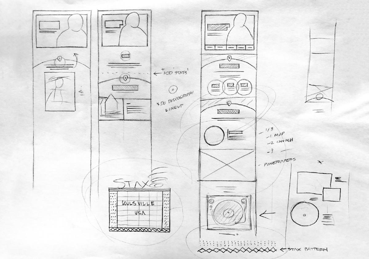
I rolled my sleeves up and got to work during early spring of 2017. The first step was researching Redding’s life and making note of key events. I was already familiar with his music and it’s impact, but focused research always has a tendency to surface facts and connections unknown. With this research, I then began to loosely piece together the framework for the story I wanted to tell with paper wireframes. This is one of my favorite parts of a project — everything is possible and ideas are still malleable. I worked the wireframes until I had a loose idea of how the content would flow from one section to the next.
Style Tiles

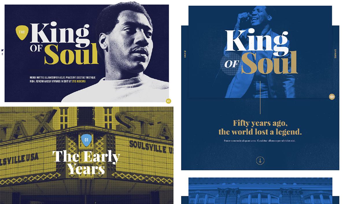
The next step was to explore general design aesthetic. My preferred method to do this is by creating style tiles, which allow you to create a direct connection with actual interface elements without defining layout. The goals here was to juxtapose design elements in a loose manner that could begin to formulate a design system quickly, without getting locked into high-fidelity design comps.
High-Fidelity
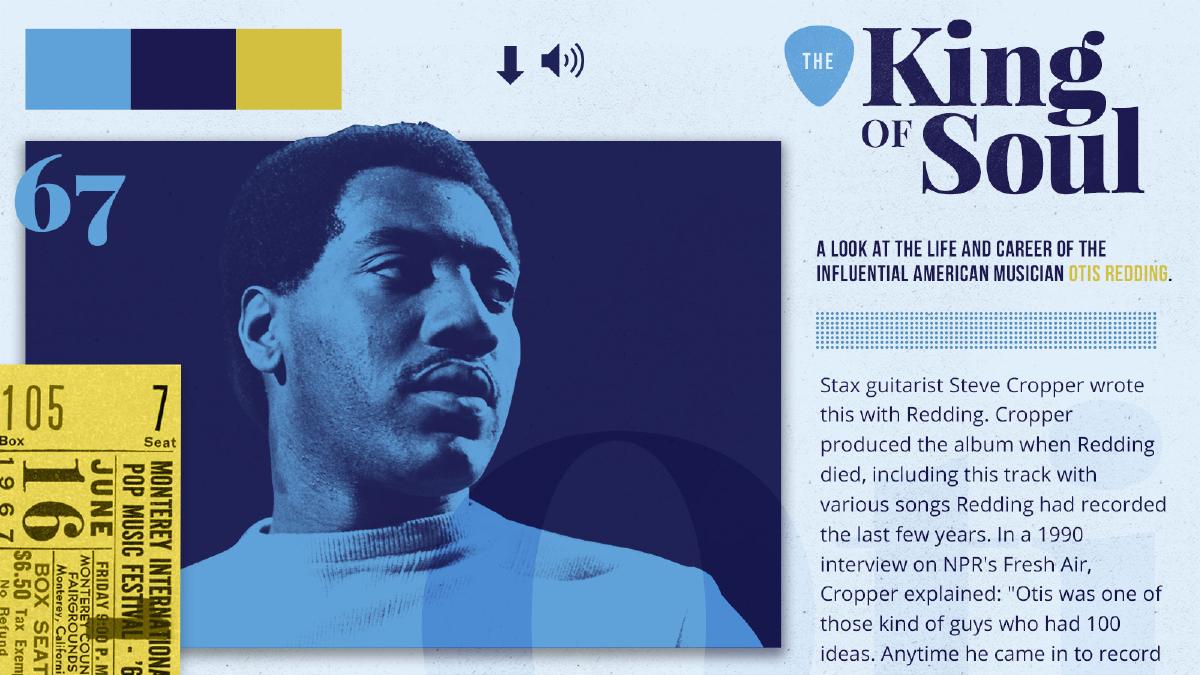
Once I felt both the wires and aesthetic were formed enough to begin, I created my first high-fidelity comp. The goals at this point is to get through an entire design, even if you feel that it’s not working. This is important because you are building a foundation for iteration, and along with it a clearer picture of what the design will look like in it’s entirety. If you continuously abandon a design halfway thought because it doesn’t feel right, you will continue to iterate over the same areas. It’s often this simple act of pushing through that opens creative alternatives and options.
I’ve come to learn after King of Soul that the process of refining and pushing content strategy doesn’t end when code begins to be written. In fact, it can and should evolve as much as the design will, and refinement should continue all the way up to launch (and beyond).
Design Iteration

The next step is to iterate and refine both the design and content. This is the hardest part, at least for me. This is because it can be hard to know when to call it complete. It’s tempting to call it complete prematurely if you are anxious to get things in the browser. Making decisions in the browser is fundamental to the work of those creative Web based experiences, but it can also push us to hastily-made content decisions as well.
I’ve come to learn after King of Soul that the process of refining and pushing content strategy doesn’t end when code begins to be written. In fact, it can and should evolve as much as the design will, and refinement should continue all the way up to launch (and beyond).
Development
King of Soul was an opportunity for me to explore a number of things from a front-end development perspective. I’ll address some the more important items here:
SVG Animations
Firstly, there is SVG animations. I’ve experimented with SVG animations before, but they were rather simple. I wanted to take the opportunity and dive into the world of complex, sequential animation. For this purpose, I reached for the GreenSock library TimelineMax, which is described on it’s website as “the ultimate sequencing tool that acts like a container for tweens and other timelines, making it simple to control them as a whole and precisely manage their timing”. On top of it’s simplicity and power, the library smoothes out cross-browser differences, and most importantly, is built with performance in mind.
I leveraged the power of TimelineMax in several areas, but perhaps the most notable is it’s use for animating records playing. Creating these animations were quite fun and I look forward to exploring this more in future projects.
Nunjucks
King of Soul provided an opportunity to also explore Nunjucks templating. Nunjucks is a powerful templating language for JavaScript, and it made building and organizing HTML a cinch. Not only does it support file includes and macros (like functions that allow parameters but for HTML), but it also supports the ability to define a template document with extends. This feature designates a predefined space for content that will be different for each page which the template is used. This way, your page markup can stay quite clean and focused on the content while inheriting the overall framework of the template file.
One particularly useful feature that I used for King of Soul is the ability to populate HTML with data defined in JSON. This allowed for me to keep markup simple can clean, while tracking similar bits of data in a separate file. Changing content was much easier this way, since I didn’t need to edit HTML.
If your interested in learning more about Nunjucks, Chris Coyier put together a great introduction over at CSS-Tricks, and this more in-depth one by Zell Liew is quite helpful for getting started.
Lazy-Loading
The ability to lazy-load images was fundamental due to the shear amount of them required on the page. In addition to this, all images had high-resolution alternatives available if needed, which are being served via srcset and sizes. I needed a flexible solution to lazy-loading images that worked well with these image attributes, while giving me programatic control of events if needed. I found the perfect solution with LazySizes, which did exactly what I needed without any configuration. Not only did this speed up the page significantly once added, but it gave me fine grain control of events on each image and provided me the ability to respond when needed.
I hope you’ve enjoyed this overview of how and why I created King of Soul. I had a lot of fun making this project, and I hope to continue making more storytelling experiences. Check out my curated storytelling resource/gallery over at storytelling.design, stay up to date by following the project on Twitter, and keep an eye out for more original stories which will be posted on this page.
