Laws of UX
Challenge
As humans, we have an underlying “blueprint” for how we perceive and process the world around us, and the study of psychology helps us define this blueprint. As designers, we can leverage psychology to build more intuitive, human-centered products and experiences. Instead of forcing users to conform to the design of a product or experience, we can use some key principles from psychology as a guide for designing how people actually are. But knowing where to start can be a challenge. Which principles from psychology are useful? What are some examples of these principles at work?
Solution
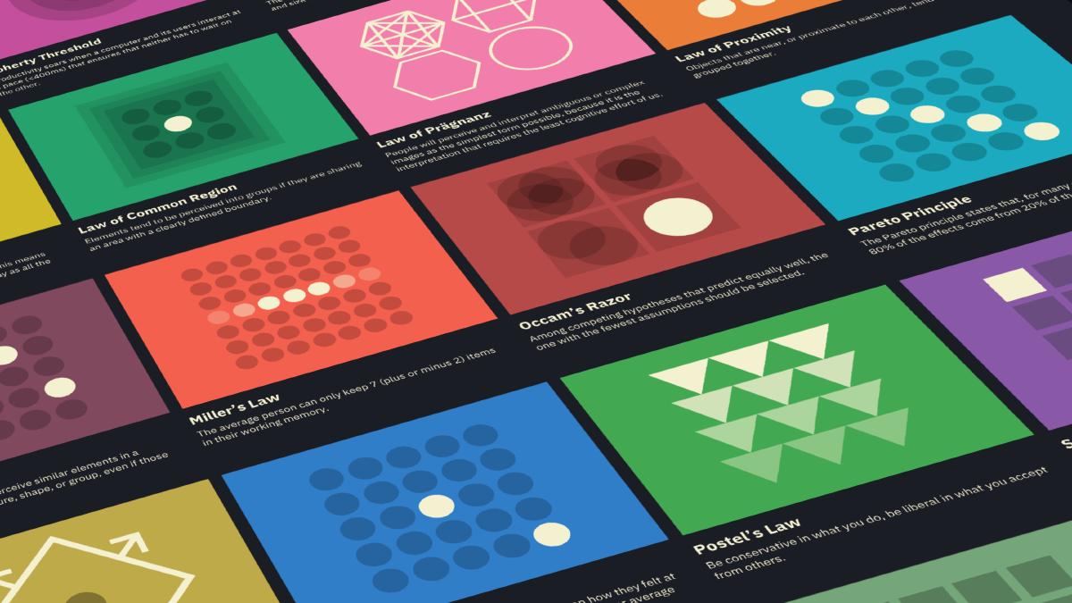
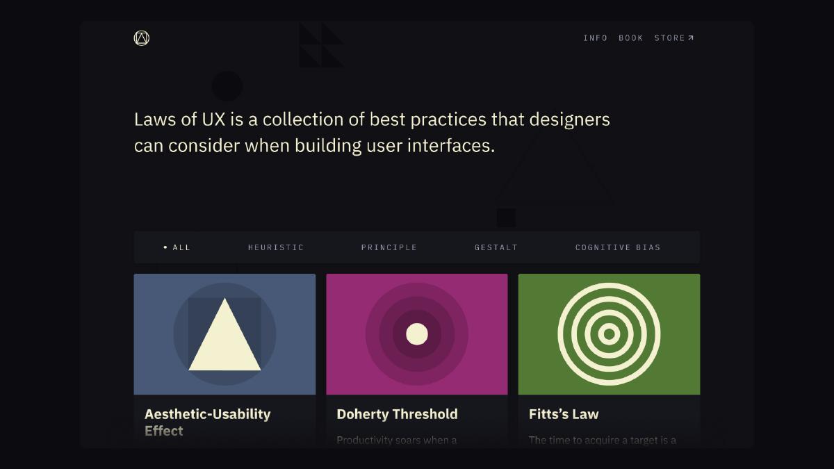
Make complex psychology heuristics accessible to more designers through an interactive resource that collects those that are relevant to user experience design and presents them in a visually engaging way.
Inspiration
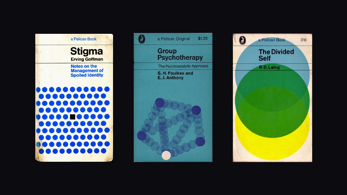
I began this project by collecting inspiration. During this time, one source of inspiration kept surfacing: vintage psychology book covers, specifically those published by Penguin Books. I was impressed with how these covers managed to communicate complex psychological concepts simply through the abstraction of color and shapes. These book covers informed the design approach and general aesthetic I would adopt throughout the project.
Wireframes
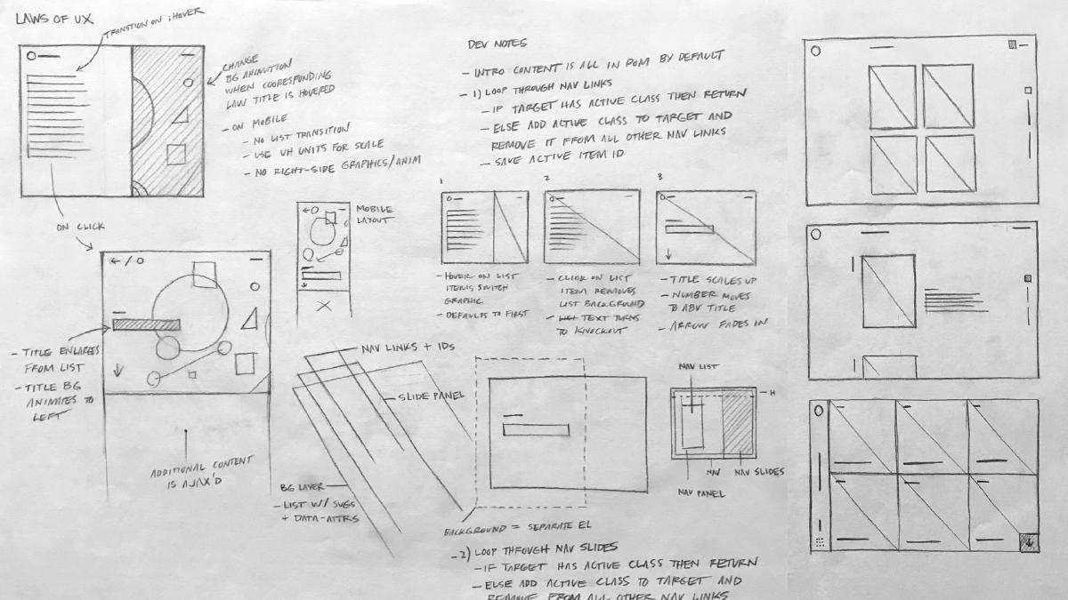
Paper wireframes provided a way to quickly explore content structure, content choreography and layout variations.
Design Exploration
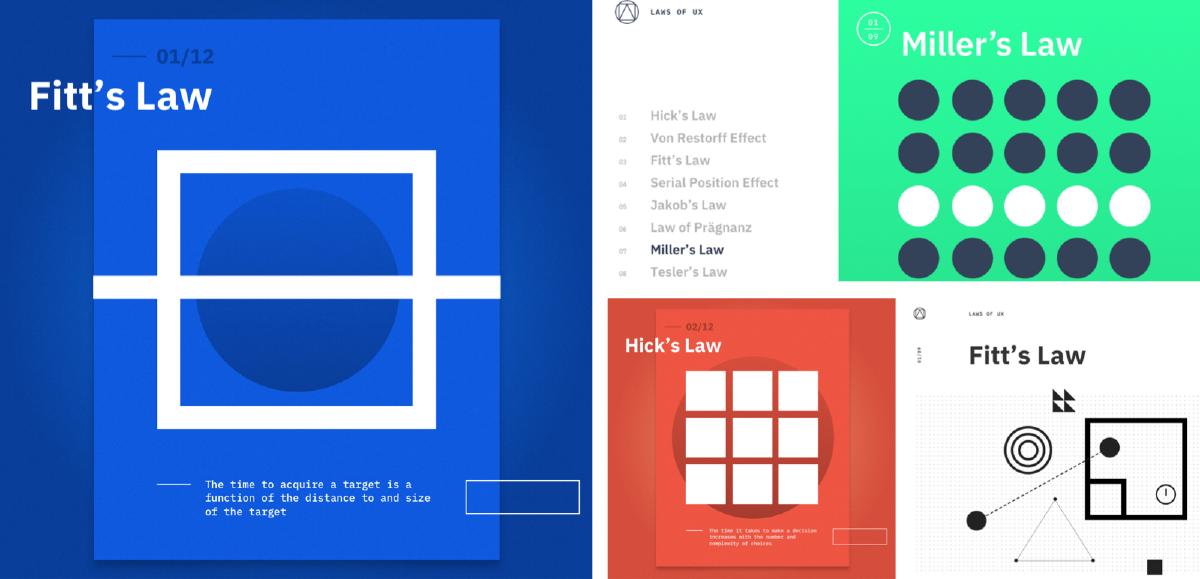
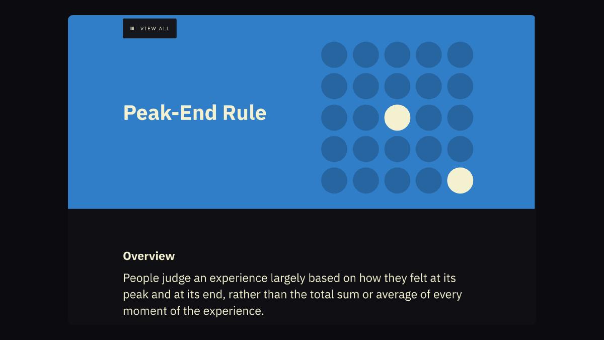
UI exploration centered around how to communicate complex psychological heuristics through the use of color and shapes. The visual language of the website would evolve based on the language of the ‘covers’ that represented each heuristic.
UI Highlights
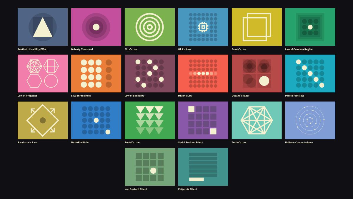
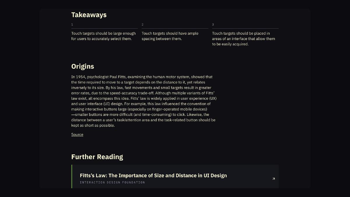
The visual language established was the result of reduction and refinement with a goal of representing each heuristic in the simplest way possible. This language was then used to inform the design of the remaining UI.
Home Page
Detail Intro
Impact
The project was well received by the design community for making complex psychology laws accessible to more designers.
- 2.5M+ page views since initial release
- Awarded Site of the Year by UX Collective in The State of UX in 2019
- Countless messages from designers/aspiring designers

