Product Detail Gallery Component
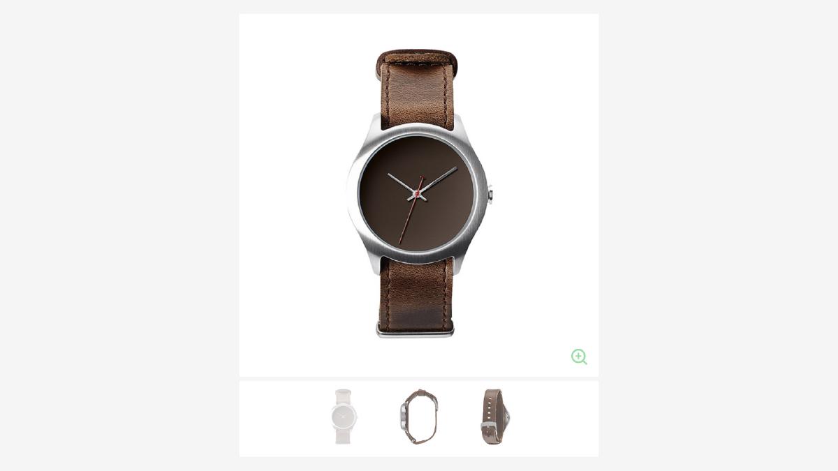
The ability to quickly toggle a variety of angles of a single product is a quite common feature on modern e-commerce websites. It allows users to see various details of a product, and often times even zoom in on a particular area of the product before potentially adding the product to their cart. In addition, a component such as this should should be as self-contained as possible and also easy to maintain.
How It Works
The way our component works is quite simple when broken down: first, we listen for any clicks on anchor tags from within our gallery component via javascript event delegation. When an anchor tag has been clicked, the default behavior (go to what is in the href value) is intercepted and prevented via event.preventDefault(). Next, the value of the anchor’s data-attribute is stored in a variable which we use to call the appropriate method, along with references to the necessary elements. These references will be passed to the method call so we can use them later.
The next step is to fire the appropriate method based on which kind of anchor tag was clicked: if the anchor’s data-gallery attribute was ‘zoom’, we will fire the .zoom(); if the data-gallery attribute was ‘thumb’, we will fire the .switch().
.zoom()
Starting with our ‘.zoom()’ method: we will store the original height of the main section in a variable via jQuery’s .outerHeight() method, as well as the ‘src’ attribute of the hero image. This method then does one of two things, based on what the ‘src’ value: a) set the hero image container height so that the container will not change when the image is replaced, switch the image to a larger version, add a ‘is-zoomed’ class on the parent element, and then initialize the .draggable() method to enable the enlarged image to be draggable within the container (via jQuery UI); or, b) remove the set height on the container (this will restore the height relative to the ‘normal’ image), change the image ‘src’ attribute to the original, and remove the ‘is-zoomed’ class on the parent element.
The basis for how this works is to have the same image in three separate directories, each directory reserved for what size the image is: thumb, normal, and zoom. By naming the image the same and placing them in these different directories, you can easily change the directory name in the src attribute to change the image.
.switch()
Next is .switch(), which will change the hero image based on the thumbnail that is selected. This is done by storing the target image’s url in an anchor tag that wraps the smaller thumbnail image. When the thumbnail is clicked, the hero image is changed by replacing the src attribute of the image with the url.
We start by storing the necessary values as variables. Next, we will add a class of ‘is-active’ to the target thumbnails wrapping anchor tag so we can styling it differently from the other thumbnails. If any of the other thumbnails have the ‘is-active’ class, we will remove it by looping through each anchor tag that wraps the thumbnail images. If the parent .gallery element has the ‘is-zoomed’ class, we will remove it and also reset the height on the wrapping element of the hero image. Finally, we change the hero image’s src attribute with the value that was stored in the anchor tag that wraps the target thumbnail.
And there it is — simple, efficient and easy to maintain. This component serves as a great foundation that can be further enhanced and customized.